 |
VALUES |
| << TECHNIQUE |
| PRACTICAL PROBLEMS >> |
rough
sheet of paper, to remove any
superfluous ink. If the
spattering is
well
done, it gives a very
delicate tone of interesting
texture, but if not
cleverly
employed, and especially if there be a
large area of it, it is
very
likely to
look out of character with
the line portions of the
drawing.
A
method sometimes employed to give a
soft black effect is to
moisten
the
lobe of the thumb lightly
with ink and press it
upon the paper. The
series
of lines of the skin make an
impression that can be reproduced
by
the
ordinary line processes. As in
the case of spatter work,
superfluous
ink
must be looked after before
making the impression so as to
avoid
leaving
hard edges. Thumb markings
lend themselves to the
rendering of
dark
smoke, and the like, where
the edges require to be soft
and vague,
and
the free direction of the
lines impart a feeling of
movement.
Interesting
effects of texture are sometimes
introduced into pen
drawings
by obtaining the impression of a canvas
grain. To produce
this,
it
is necessary that the
drawing be made on fairly
thin paper. The modus
operandi
is
as follows: Place the
drawing over a piece of
mounted
canvas
of the desired coarseness of
grain, and, holding it
firmly, rub a
lithographic
crayon vigorously over the
surface of the paper. The
grain
of
the canvas will be found to be clearly
reproduced, and, as the
crayon
is
absolutely black, the effect
is capable of reproduction by the
ordinary
photographic
processes.
CHAPTER
IV
VALUES
After
the subject has been
mapped out in pencil, and
before beginning The
Color
the
pen work, we have to consider
and determine the proper
disposition Scheme
of
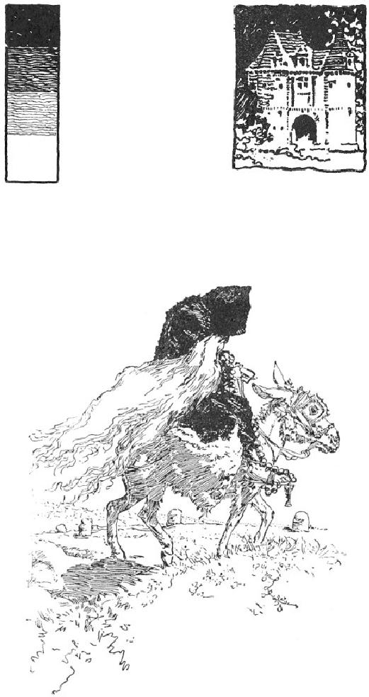
the Color. By "color" is
meant, in this connection,
the gamut of values
from
black to white, as indicated in
Fig. 23. The success or
failure of the
drawing
will largely depend upon the
disposition of these elements,
the
quality
of the technique being a
matter of secondary concern. Beauty
of
line
and texture will not redeem
a drawing in which the
values are badly
disposed,
for upon them we depend
for the effect of unity, or
the
pictorial
quality. If the values are
scattered or patchy the
drawing will not
focus
to any central point of
interest, and there will be no unity in
the
result.
There
are certain general laws by
which color may be
pleasingly
disposed,
but it must be borne in mind
that it ought to be
disposed
naturally
as well. By a "natural" scheme of
color, I mean one which is
consistent
with a natural effect of
light and shade. Now the
gradation
from
black to white, for example,
is a pleasing scheme, as may be
observed
in Fig. 24, yet the
effect is unnatural, since the
sky is black. In
a
purely decorative illustration
like this, however, such
logic need not be
considered.
Since,
as I said before,
Principality
color
is the factor which
in
the Color-
makes
for the unity of
the
Scheme
result,
the first principle
to
be
regarded
in
its
arrangement
is that of
Principality,--there
must be
some
dominant note in the
rendering.
There should not,
for
instance, be two
principal
dark
spots of equal value
in
the
same drawing, nor
two
equally
prominent areas of
white.
The Vierge drawing, FIG. 24
D.
A. GREGG
FIG.
23 C. D. M.
Fig.
25, and that by Mr. Pennell,
Fig. 5, are no
exceptions
to
this rule; the black
figure of the old man
counting as one note in
the
former,
as do the dark arches of the
bridge in the latter. The
work of both
these
artists is eminently worthy of
study for the knowing
manner in
which
they dispose their
values.
FIG.
25
DANIEL
VIERGE
The
next thing to be sought is
Variety. Too obvious or
positive a Variety
scheme,
while possibly not
unsuitable for a conventional
decorative
drawing,
may not be well adapted to a
perspective subject. The
large
color
areas should be echoed by
smaller ones throughout the
picture.
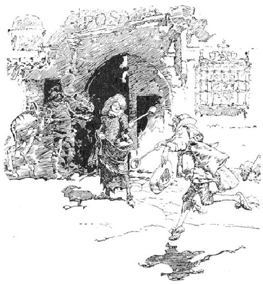
Take,
for example, the Vierge
drawing shown in Fig. 26.
Observe how
the
mass of shadow is relieved by
the two light holes
seen through the
inn
door. Without this
repetition of the white the
drawing would lose
much
of its character. In Rico's
drawing, Fig. 11, a tiny
white spot in the
shadow
cast over the street would,
I venture to think, be
helpful,
beautifully
clear as it is; and the
black area at the end of the
wall seems a
defect
as it competes in value with
the dark figure.
FIG.
26
DANIEL
VIERGE
Lastly,
Breadth of Effect has to be considered.
It is requisite that, Breadth
of
however
numerous the tones are (and
they should not be too
numerous), Effect
the
general effect should be
simple and homogeneous. The
color must
count
together broadly, and not be
cut up into patches.
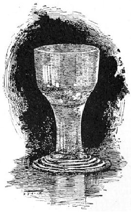
FIG.
27
HARRY
FENN
It
is important to remember that
the gamut from black to
white is a
short
one for the pen. One
need only try to faithfully
render the high
lights
of an ordinary table glass
set against a gray background, to
be
assured
of its limitations in this
respect. To represent even
approximately
the
subtle values would require
so much ink that nothing
short of a
positively
black background would
suffice to give a semblance of
the
delicate
transparent effect of the
glass as a whole. The gray
background
would,
therefore, be lost, and if a really
black object were also part
of the
picture
it could not be represented at
all. Observe, in Fig. 27,
how just
such
a problem has been worked
out by Mr. Harry
Fenn.
It
will be manifest that the
student must learn to think
of things in their
broad
relation. To be specific,--in the
example just considered, in
order
to
introduce a black object the
scheme of color would have
needed
broadening
so that the gray background
could be given its proper
value,
thus
demanding that the elaborate
values of the glass be
ignored, and just
enough
suggested to give the
general effect. This
reasoning would
equally
apply were the light
object, instead of a glass, something
of
intricate
design, presenting positive shadows.
Just so much of such
a
design
should be rendered as not to darken
the object below its
proper
relative
value as a whole. In this
faculty of suggesting things
without
literally
rendering them consists the
subtlety of pen drawing.
It
may be said, therefore, that
large light areas resulting
from the
necessary
elimination of values are
characteristic of pen drawing.
The
degree
of such elimination depends, of course,
upon the character of
the
subject,
this being entirely a matter
of relation. The more black
there is in
a
drawing the greater the
number of values that can be
represented.
Generally
speaking, three or four are
all that can be managed, and
the
beginner
had better get along
with three,--black, half-tone, and
white.
FIG.
28
REGINALD
BIRCH
While
it is true that every
subject is likely to contain
some motive or Various
suggestion
for its appropriate color-scheme, it
still holds that, many
Color-
times,
and especially in those cases where
the introduction of foreground
Schemes
features
at considerable scale is necessary
for the interest of the
picture,
an
artificial arrangement has to be devised.
It is well, therefore, to be
acquainted
with the possibilities of
certain color combinations.
The most
brilliant
effect in black and white
drawing is that obtained by
placing the
prominent
black against a white area
surrounded by gray. The
white
shows
whiter because of the gray
around it, so that the
contrast of the
black
against it is extremely vigorous and
telling. This may be said to
be
the
illustrator's tour
de force. We have
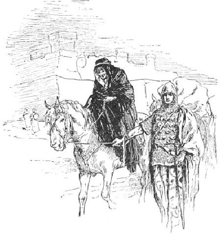
it illustrated by Mr. Reginald
Birch's
drawing, Fig. 28. Observe
how the contrast of black
and white is
framed
in by the gray made up of
the sky, the left
side of the building,
the
horse, and the knight. In
the drawing by Mr. Pennell,
Fig. 29, we
have
the same scheme of color.
Notice how the trees
are darkest just
where
they are required to tell
most strongly against the
white in the
centre
of the picture. An admirable
illustration of the effectiveness of
this
color-scheme
is shown in the "Becket" poster by
the "Beggarstaff
Brothers,"
Fig. 69. Another scheme is
to have the principal black
in the
gray
area, as in the Vierge
drawing, Fig. 26 and in
Rico's sketch, Fig.
11.
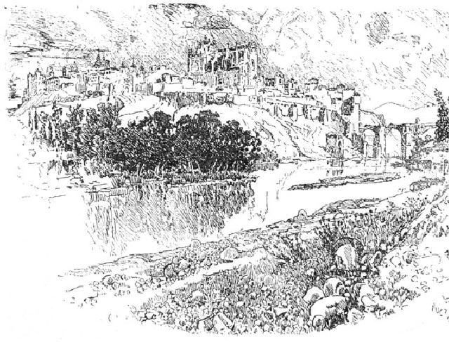
FIG.
29
JOSEPH
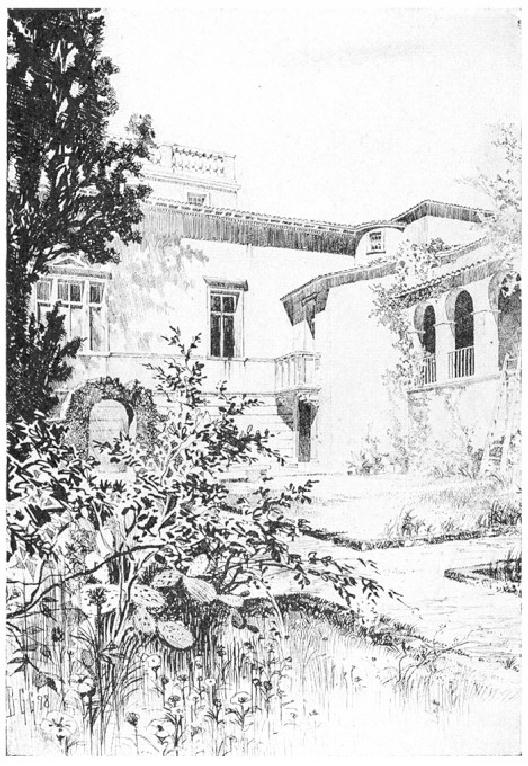
FIG.
30
B.
G. GOODHUE
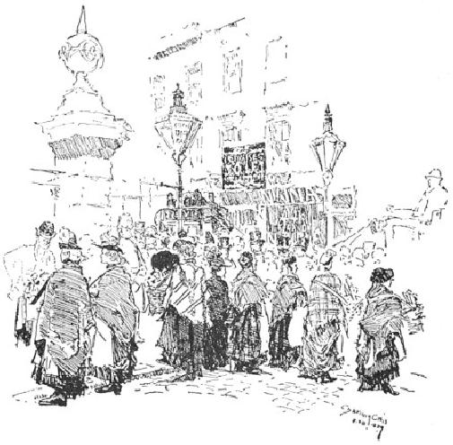
FIG.
31
JOSEPH
PENNELL
Still
another and a more restful
scheme is the actual
gradation of color.
This
gradation, from black to
white, wherein the white
occupies the
centre
of the picture, is to be noted in
Fig. 20. Observe how
the dark side
of
the foreground tree tells against
the light side of the one
beyond,
which,
in its turn, is yet so
strongly shaded as to count
brilliantly against
the
white building. Still again,
in Mr. Goodhue's drawing, Fig.
30, note
how
the transition from the
black tree on the left to
the white building is
pleasingly
softened by the gray shadow.
Notice, too, how the
brilliancy
of
the drawing is heightened by
the gradual emphasis on the
shadows
and
the openings as they approach
the centre of the picture.
Yet another
example
of this color-scheme is the
drawing by Mr. Gregg, Fig.
50. The
gradation
here is from the top of the
picture downwards. The
sketch of
the
coster women by Mr. Pennell, Fig.
31, shows this gradation
reversed.
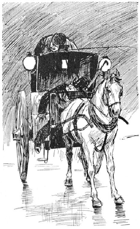
The
drawing of the hansom cab,
Fig. 32, by Mr. Raven Hill,
illustrates
a
very strong color-scheme,--gray and
white separated by black,
the
gray
moderating the black on the
upper side, leaving it to
tell strongly
against
the white below. Notice
how luminous is this same
relation of
color
where it occurs in the
Venetian subject by Rico,
Fig. 14. The
shadow
on the water qualifies the
blackness of the gondola
below,
permitting
a brilliant contrast with
the white walls of the
building above.
It
is interesting to observe how Vierge and
Pennell, but chiefly
the
former,
very often depend for
their grays merely upon
the delicate tone
resulting
from the rendering of form
and of direct shadow,
without any
local
color. This may be seen in
the Vierge drawing, Fig.
33. Observe in
this,
as a consequence, how brilliantly the
tiny black counts in the
little
figure
in the centre. Notice, too,
in the drawing of the
soldiers by
Jeanniot,
Fig. 34, that there is
very little black; and yet
see how brilliant
is
the effect, owing largely to
the figures being permitted
to stand out
against
a white ground in which
nothing is indicated but the
sky-line of
the
large building in the
distance.
FIG.
32
L.
RAVEN HILL
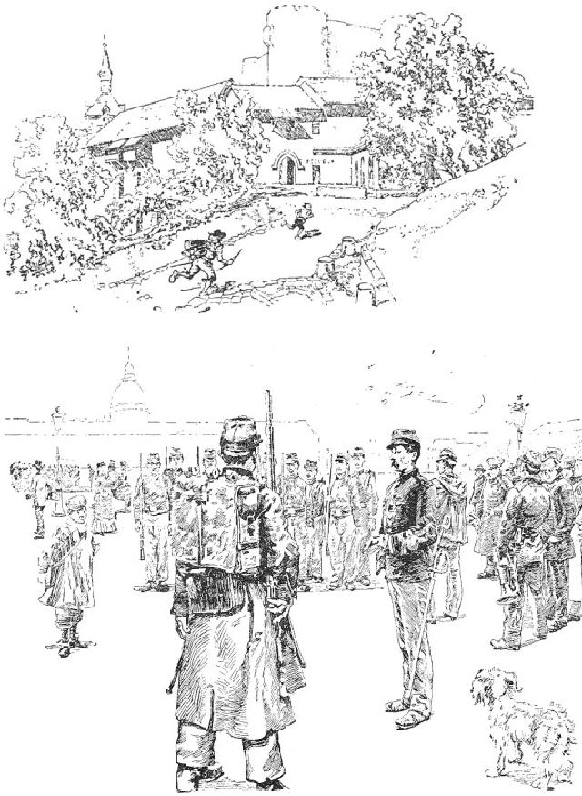
FIG.
33
DANIEL
VIERGE
FIG.
34