 |
COLOR THEORY, STEREOPSIS, READING, HEARING, TOUCH, MOVEMENT |
| << HUMAN INPUT-OUTPUT CHANNELS, VISUAL PERCEPTION |
| COGNITIVE PROCESS: ATTENTION, MEMORY, REVISED MEMORY MODEL >> |

Human
Computer Interaction
(CS408)
VU
Another
illusion created by our expectations
compensating an image is
the
proofreading
illusion. Example is shown
below
The
quick brown
fox
jumps over the
the
lazy dog.
The
way that objects are composed
together will affect the way
we perceive them, and
we do not
perceive geometric shapes
exactly as they are drawn.
For example, we tend
to
magnify horizontal lines and
reduce vertical. So a square needs to be
slightly
increased in
height to appear square and
line will appear thicker if horizontal
rather
than
vertical.
Optical
illusions also affect page
symmetry. We tend to see the
center of a page as
being a
little above the actual
center so if a page is arranged
symmetrically around
the
actual center, we will see it as
too low down. In graphic
design this is known
as
the
optical center.
These are
just a few examples of how
the visual system
compensates, and
sometime
overcompensates, to
allow us to perceive the
world around us.
Lecture
8
Lecture 8.
Human
Input-Output Channels
Part
II
Learning
Goals
As the
aim of this lecture is to
introduce you the study of
Human Computer
Interaction,
so that after studying this
you will be able to:
Understand
role of color theory in
design
·
Discuss
hearing perception
·
Discuss
haptic perception
·
Understand
movement
·
8.1
Color
Theory
Color
theory encompasses a multitude of
definitions, concepts and
design
applications.
All the information would fill
several encyclopedias. As an
introduction,
here are
a few basic concepts.
62
Human
Computer Interaction
(CS408)
VU
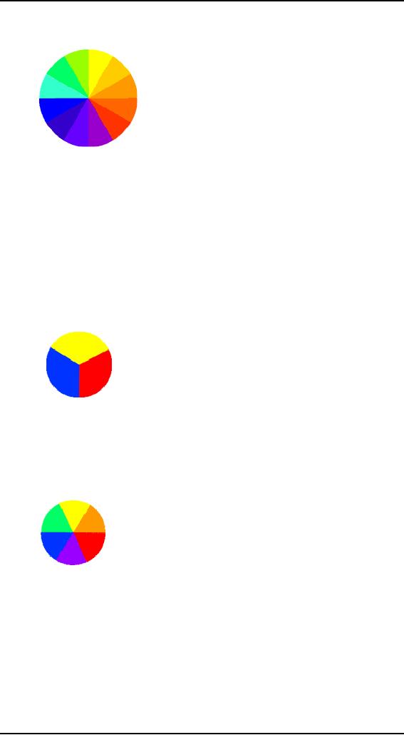
The
Color Wheel
A color
circle, based on red, yellow
and blue, is traditional in
the field of art. Sir
Isaac
Newton
developed the first circular
diagram of colors in 1666. Since
then scientists
and
artists have studied and
designed numerous variations of
this concept.
Differences
of
opinion about the validity
of one format over another
continue to provoke debate.
In
reality, any color circle or
color wheel, which presents
a logically arranged
sequence
of pure hues, has
merit.
Primary
Colors
In
traditional color theory,
these are the 3 pigment
colors that cannot be mixed
or
formed by
any combination of other
colors. All other colors are
derived from these 3
hues
PRIMARY
COLORS
Red,
yellow and blue
Secondary
Colors
These are
the colors formed by mixing
the primary colors.
SECONDARY
COLORS
Green,
orange and purple
Tertiary
colors
These are
the colors formed by mixing
one primary and one
secondary color.
63

Human
Computer Interaction
(CS408)
VU
TERTIARY
COLORS
Yellow-orange,
red-orange, red-purple, blue-purple,
blue-green and
yellow-
green.
Color
Harmony
Harmony
can be defined as a pleasing
arrangement of parts, whether it be
music,
poetry,
color, or even an ice cream
sundae.
In visual
experiences, harmony is something
that is pleasing to the eye.
It engages the
viewer
and it creates an inner
sense of order, a balance in
the visual experience.
When
something
is not harmonious, it's
either boring or chaotic. At
one extreme is a
visual
experience
that is so bland that the
viewer is not engaged. The
human brain will
reject
under-stimulating
information. At the other
extreme is a visual experience
that is so
overdone,
so chaotic that the viewer
can't stand to look at it. The
human brain rejects
what it
cannot organize, what it
cannot understand? The visual
task requires that we
present a
logical structure. Color
harmony delivers visual
interest and a sense
of
order.
In
summary, extreme unity leads to
under-stimulation, extreme complexity leads to
over-
stimulation.
Harmony is a dynamic equilibrium.
Some
Formulas for Color Harmony
There are
many theories for harmony.
The following illustrations
and descriptions
present
some basic formulas.
Analogous
colors
Analogous
colors are any three
colors, which are side by
side on a 12 part
color
wheel,
such as yellow-green, yellow,
and yellow-orange. Usually
one of the three
colors
predominates.
A color
scheme based on analogous
colors
64
Human
Computer Interaction
(CS408)
VU
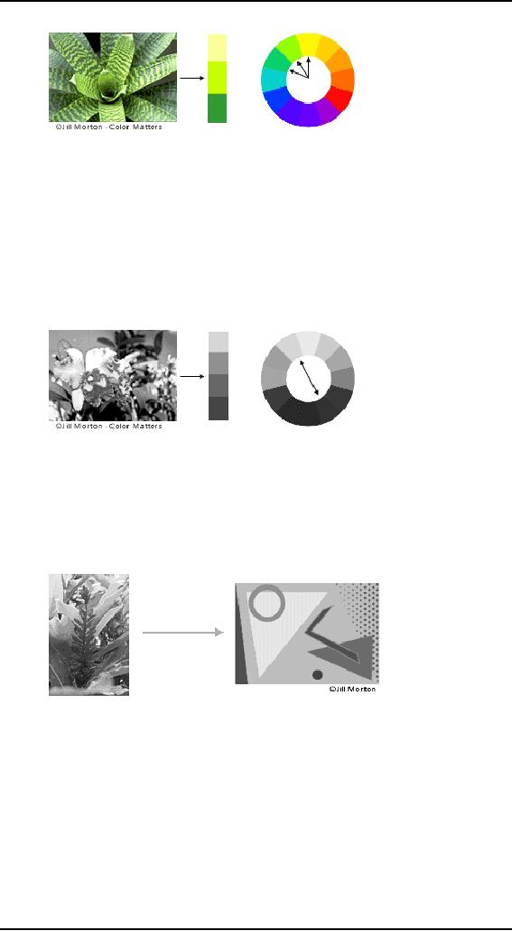
Complementary
colors
Complementary
colors are any two
colors, which are directly
opposite each other,
such as
red and green and
red-purple and yellow-green. In
the illustration above,
there
are
several variations of yellow-green in
the leaves and several
variations of red-
purple in
the orchid. These opposing
colors create maximum contrast
and maximum
stability.
A color
scheme based on complementary
colors
Natural
harmony
Nature
provides a perfect departure
point for color harmony. In
the illustration
above,
red
yellow and green create a
harmonious design, regardless of whether
this
combination
fits into a technical
formula for color
harmony.
A color
scheme based on
nature
.
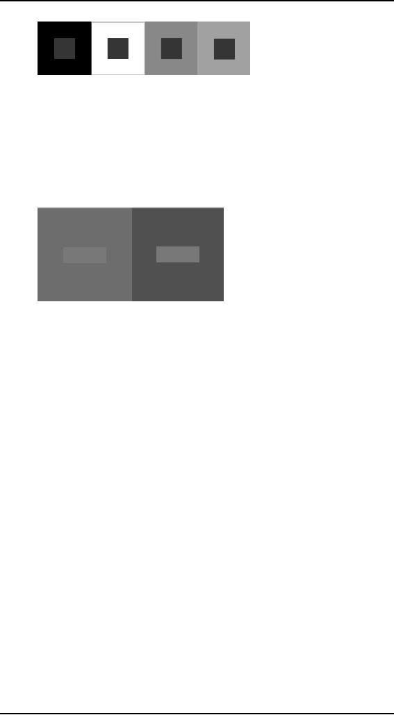
Color
Context
How
color behaves in relation to other
colors and shapes is a
complex area of color
theory.
Compare the contrast effects of
different color backgrounds
for the same
red
square.
65
Human
Computer Interaction
(CS408)
VU
Red
appears more brilliant
against a black background
and somewhat duller
against
the
white background. In contrast
with orange, the red
appears lifeless; in
contrast
with
blue-green, it exhibits brilliance.
Notice that the red
square appears larger
on
black
than on other background
colors.
Different
readings of the same
color
As we age,
the color of lens in eye
changes. It becomes yellow
and absorb shorter
wavelengths
so the colors with shorter
wavelength will not be visible as we
aged. So,
do not
use blue for text or
small objects. As we age,
the fluid between lens and
retina
absorbs
more light due to which
eye perceive lower level of
brightness. Therefore
older
people need brighter
colors.
Different
wavelengths of light focused at
different distances behind
eye's lens this
require
constant refocusing which causes
fatigue. So, be careful about
color
combinations.
Pure (saturated) colors require
more focusing then less
pure. Therefore
do not
use saturated colors in User
interface unless you really
need something to stand
out
(danger sign).
Guidelines
Opponent
colors go well together (red
& green) or (yellow &
blue)
·
Pick
non-adjacent colors on the
hue circle
·
Size of
detectable changes in color
varies. For example, it is
hard to detect
·
changes
in reds, purples, & greens
and easier to detect changes
in yellows &
blue-greens
Older
users need higher brightness
levels to distinguish
colors
·
Hard to
focus on edges created by color
alone, therefore, use both
brightness
·
&
color differences
Avoid
red & green in the
periphery due to lack of RG
cones there, as
yellows
·
&
blues work in
periphery
Avoid
pure blue for text,
lines, & small
shapes.
·
66
Human
Computer Interaction
(CS408)
VU
Blue
makes a fine background
color
·
Avoid
adjacent colors that differ
only in blue
·
Avoid
single-color distinctions but
mixtures of colors should
differ in 2 or 3
·
colorse.g.,
2 colors shouldn't differ
only by amount of red
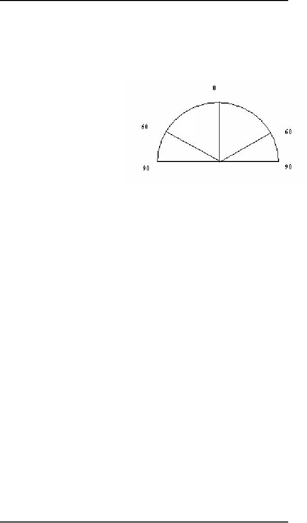
Accurate
color discrimination is at -+60 degree of
straight head position.
Limit of
color awareness is -+90 degree of
straight head position
·
8.2
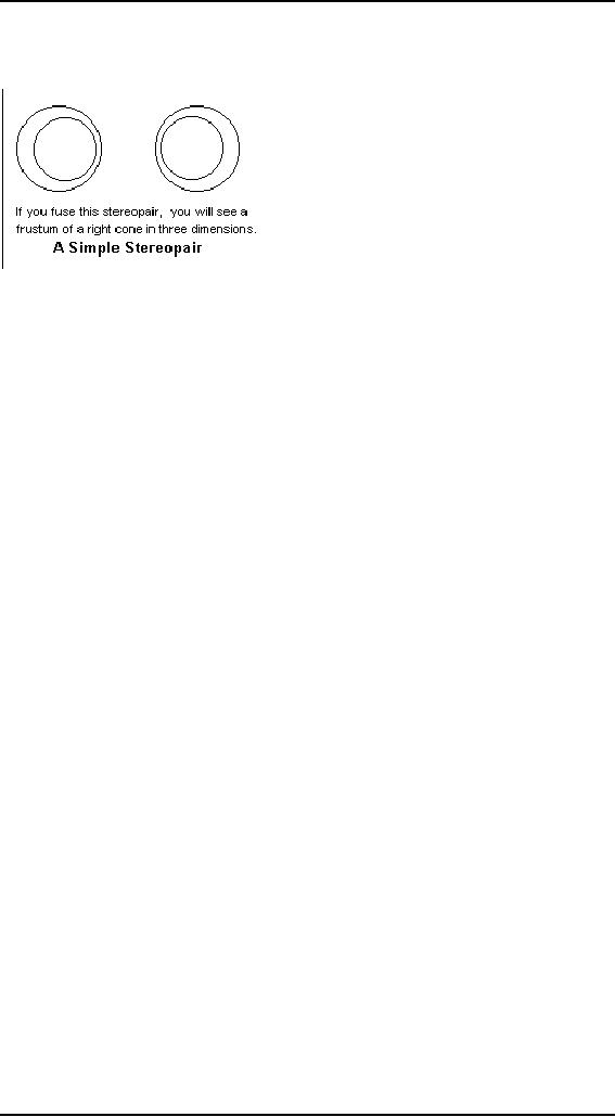
Stereopsis
-
Introduction
3D
vision, binocular
vision and
stereopsis
all mean
the same thing: That
remarkable
power of
the visual sense to give an
immediate perception of depth on
the basis of the
difference
in points of view of the two
eyes. It exists in those animals
with
overlapping
optical fields, acting as a
range finder for objects
within reach. There
are
many
clues to depth, but stereopsis is
the most reliable and
overrides all others.
The
sensation
can be excited by presenting a
different, properly prepared,
view to each
eye.
The pair of views is called
a stereopair
or
stereogram, and
many different ways
have been
devised to present them to the
eye. The appearance of depth in
miniature
views
has fascinated the public
since the 1840's, and still
appears now and then at
the
present
time. There was a brief,
but strong, revival in the
1990's with the invention
of
the
autostereogram. Stereopsis also has
technical applications, having been
used in
aerial
photograph interpretation and
the study of earth
movements, where it
makes
small or
slow changes visible.
The
word stereopsis was coined
from the Greek στερεοs, solid
or firm, and οψιs,
look or
appearance. Since terms derived from
Greek are often used in
this field, it
may be
useful to have a brief discussion.
Single and double vision
are called haplopia
and
diplopia,
respectively, from 'αsλουs
(haplous) and διsλουs
(diplous), which
mean
"single" and "double".
Haplopia is the happy case;
with diplopia we are seeing
double.
The use of a Greek term
removes the connotations that
may attach to a
common
English word, and sounds
much more scientific. Note
that the "opia" part
of
these
words refers to "appearance",
and does not come
from a word for "eye".
The -s-
has been
dropped for euphony.
Otherwise, the closest Greek
to "opia" means a
cheese
from
milk curdled with fig
juice. "Ops", for that
matter is more usually
associated
with
cooked meat or evenings. In fact,
words like "optic" come
from οsτικοs,
meaning
"thing seen", from the
future οψσοµαι
of
οραω, (horao)
"to see", not from a
reference
to the eye. The Latin
oculus
does mean
"eye" and is used in many
technical
terms,
like binocular, which
combines Greek and
Latin.
Stereopsis
67
Human
Computer Interaction
(CS408)
VU
Stereopsis
is
the direct sensing of the distance
of
an object
by comparing the images received by
the
two
eyes. This is possible only
when the eyes of a
creature
look in the same direction,
and have
overlapping
fields. The placing of the
two eyes
this
way gives up the opportunity
of a wide field
of view
obtained with eyes on the
sides of the
head. Predators
find it best to have eyes in
front,
prey to
have them on the sides.
Stereopsis yields benefits for close
work, such as
fighting
for cats and hand
work for humans. Note that
normal binocular vision
is
single, so that
the two images have been fused by the
brain. There is no evidence
that
the
image resulting from the
many simple eyes of an
insect is not also fused in
a
similar
way.
Visual
perception makes use of a
large number of distance clues to create
its three-
dimensional
picture from the
two-dimensional retinal images. Strong
clues are the
apparent
sizes of objects of known size,
overlapping and parallax, shadows
and
perspective.
Weaker clues are atmospheric
perspective (haze and scattering),
speed of
movement,
and observed detail. The
strongest clue of all, however, is
stereopsis,
which
overrides all other evidence
save touch itself. The
convergence of the
optic
axes of
the two eyes, and
their distance accommodation, when
fixated on an object,
do not
seem to be strong clues, though
some have believed them to
be. Although we
have
two eyes, we usually have
only one visual world,
which is a remarkable
and
important
fact calling for
explanation. Stereopsis gives a reliable
distance clue as far
away as
450 metres, Helmholtz estimated.
The fineness of the comparison
that must
be made
by the visual system is
remarkable.
The
interpretation of retinal images to
produce stereopsis is entirely
mental, and must
be
learned. When the images on
the eyes are consistent with
the observation of a
single
object, the two flat images
fuse
to
form a vivid three-dimensional
image. With
practice,
fusion can be achieved with
two pictures side by side
and the eyes
voluntarily
diverged so that each eye
sees its picture straight
ahead, though
accommodated
for the actual distance.
Both the original pictures
remain in view, but a
third,
fused, image appears before
them when the concentration
is diverted to it that
appears
strikingly solid. The brain
regards this fused image as
the real one, the
others
as mere ghosts.
This skill is called free
fusion, and
requires considerable practice
to
acquire.
In free fusion, both the
convergence of the eyes, and
their distance
accommodation,
are inconsistent with the
actual location of the
image, and must be
overridden
by stereopsis. It shows, incidentally, that
convergence of the optic
axes is
not a
strong depth clue. By the
use of a stereoscope, one
can achieve fusion
without
diverging
the eyes, or focusing on a close
object with the eyes so
diverged, so no
practice
or skill is required. A stereoscope
mainly changes the
directions in which
the
two
images are seen so that they
can both be fixated by
normally converged eyes.
The
two
images are called a stereo
pair.
When
the images on the retinas are
too different to be views of
the same object,
rivalry
occurs,
and either one image is
favoured and the other
suppressed, or a
68
Human
Computer Interaction
(CS408)
VU
patchwork
of parts of the two images is seen.
When everything corresponds
except
the
illumination or colour, the
fused image exhibits lustre.
The
fundamentals of stereopsis were
discovered by Charles Wheatstone in
1836,
when
stereopairs had to be created by drawing
(this could be aided with
the camera
obscura,
but was very difficult
except for stick images).
The methods of descriptive
geometry
can be used to create stereopairs. He
designed the mirror
stereoscope, which
directs
the view of the images into
the eyes with plane
mirrors and reflection at
about
45 .
David Brewster invented the
prism stereoscope, which
used prisms to deviate
the
light, which made a more
compact and convenient apparatus. Lenses
can also be
used to
decrease the viewing distance
and make fixation easier.
Photograpy was the
natural
way to create stereopairs. A stereopair
can also be drawn in two
colours with
the
views superimposed. When
this anaglyph
is
viewed through coloured
filters that
present
one image to each eye,
fusion is easy. A similar
method is to project the
two
images in
orthogonal polarizations, and to
view them through polarizing
filters. Both
of these
methods have been used to project 3D
films and transparencies before
an
audience.
A small fraction of people, perhaps
4%, have defective
stereopsis.
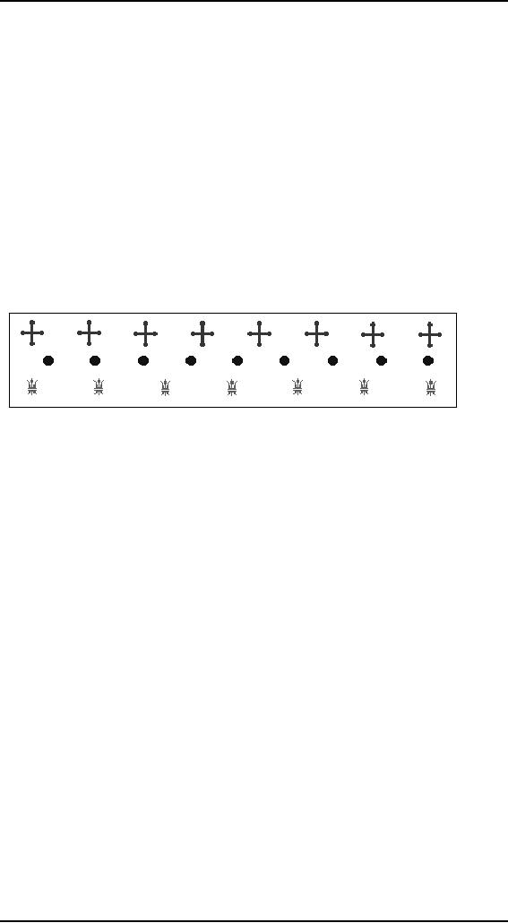
The
pattern above demonstrates the
stereoscopic wallpaper
illusion,
which was first
discovered
by H. Meyer in 1842, and
also noted by Brewster. When
viewed with the
eyes
parallel, a strong stereoscopic effect is
seen. The green
fleurs-de-lis are
farthest
away,
the blue discs closest, and
the red crosses at an
intermediate distance. This is
an
autosterogram, a
single figure that gives
stereoscopic images to the two eyes.
Since
the
figures in a line are
identical, when the eyes
are turned for free
fusion, two
different
figures are assumed to be parallactic
views of the same object.
The eye finds
it
preferable to fuse the images rather
than report double vision.
It is easier to fuse this
autostereogram
than a normal stereopair, so it is
good practice for developing
the
useful
skill of free fusion.
The
mind does not have to
recognize the object in a
stereopair for fusion to
occur. The
pattern
can be random, but the
stereopair must represent the same
random pattern as
seen
from the different positions
of the eyes (Julesz, 1960).
Even more strikingly,
a
single
apparently random pattern
can be fused autostereographically to
give a three-
dimensional
image. No image is seen
until fusion occurs. Each point on
the image
must be
capable of interpretation as two
different points of a stereopair.
These
random-dot
autostereograms were widely enjoyed in
the 1980's. An autostereogram
requires
free fusion, which must be
learned in order to appreciate
them. Many people
found
this difficult, so the autostereograms
were usually presented as a kind of
puzzle.
Psychologists
have argued about stereopsis
for many years, but most of
their musings
are not
worth repeating. A widely
held theory was that
the two retinas were
somehow
mapped
point-by-point, and differing
image positions with respect
to this reference
frame
was interpreted stereoptically. It
seems more likely to me that
the images are
compared
by the visual sense for
differences, than by their
absolute locations on
the
retina.
In the past, psychologists have
preferred mechanical explanations,
where the
brain
and retina are created with
built-in specializations and
functions, spatially
69

Human
Computer Interaction
(CS408)
VU
localized,
rather than regarding the
organs as canvases, which the
cognitive powers
organize
as necessary.
I have
not discussed the broad
and interesting field of
optical illusions here, since
they
tell us
nothing definite about the
inner workings of the visual
sense, only give
examples
of its operation, and also
because the 'reasons' for
them are
controversial,
and
the arguments are not
especially enlightening. Illusions are
discussed at length in
another
article on this website. The
oldest and most widely known
illusion is the
horizon
illusion, in which the moon
appears larger on the
horizon than at the
zenith.
This
illusion was known and
discussed in antiquity, and is
still the subject of
much
study.
Its explanation is not
known. For the application
of the visual sense
to
investigation
and appreciation of the
world around us, Minnaert's
book is outstanding.
8.3
Reading
So far we
have concentrated on the
perception of images in general. However,
the
perception
and processing of text is a special
case that is important to
interface design,
which
inevitably requires some
textual display.
There
are several stages in the
reading process. First the
visual pattern of the word
on
the
page is perceived. It is then decoded
with reference to an internal
representation of
language.
The final stages of language
processing include syntactic and
semantic
analysis
and operate on phrases or
sentences.
We are most
interested with the first
two stages of this process
and how they
influence
interface design. During
reading, the eye makes
jerky movement called
saccades
followed by fixations. Perception
occurs during the fixation
periods, which
account
for approximately 94% of the
time elapsed. The eye moves
backwards over
the
text as well as forwards, in
what are known as regressions. If the
text is complex
there
will be more regressions.
8.4
Hearing
The
sense of hearing is often
considered secondary to sight, but we
tend to
underestimate
the amount of information
that we receive through our
ears.
The human
ear
Hearing
begins with vibrations in
the air or sound waves.
The ear receives these
vibrations
and transmits them, through
various stages, to the
auditory nerves. The
ear
comprises
three sections commonly known as
the outer ear, middle ear
and inner ear.
70
Human
Computer Interaction
(CS408)
VU
The
outer ear is the visible
part of the ear. It has two
parts: the pinna, which is
the
structure
that is attached to the
sides of the head, and the
auditory canal, along
which
sound
waves are passed to the middle ear.
The outer ear serves
two purposes. First, it
protects
the sensitive middle ear
from damage. The auditory
canal contains wax,
which
prevents dust, dirt and
over-inquisitive insects reaching
the middle ear. It also
maintains
the middle ear at a constant
temperature. Secondly, the
pinna and auditory
canal
serve to amplify some
sounds.
The
middle ear is a small cavity
connected to the outer ear
by the tympanic
membrane,
or eardrum, and to the inner
ear by the cochlea. Within
the cavity are the
ossicles,
the smallest bones in the
body. Sound waves pass along
the auditory canal
and
vibrate the ear drum
which in turn vibrates the
ossicles, which transmit
the
vibrations
to the cochlea, and so into
the inner ear.
The
waves are passed into
the liquid-filled cochlea in
the inner ear. Within
the
cochlea
are delicate hair cells or
cilia that bend because of
the vibrations in the
cochlean
liquid and release a
chemical transmitter, which
causes impulses in
the
auditory
nerve.
Processing
sound
Sound
has a number of characteristics, which we
can differentiate.
Pitch
Pitch is
the frequency of the sound.
A low frequency produces a low
pitch, a high
frequency,
a high pitch.
Loudness
Loudness
is proportional to the amplitude of
the sound; the frequency
remains
constant.
Timber
Timber
related to the type of the
sound
71

Human
Computer Interaction
(CS408)
VU
Sounds
may have the same
pitch and loudness but be made by
different instruments
and so
vary in timber.
Sound
characteristics
Audible
range is 20 Hz to 15 KHz. Human ear can
distinguish between changes
less
than
1.5 Hz but less accurate at
higher frequencies. Different
frequencies trigger
neuron
activity causing nerve
impulses. Auditory system
filters sounds e.g.,
Cocktail
Party
Effect
8.5
Touch
The
third sense is touch or
haptic perception. Although
this sense is oftern viewed
as
less
important than sight or
hearing, imagine life
without it. Touch provides
us with
vital
information about our
environment. It tells us when we
touch something hot
or
cold,
and can therefore act as a
warning. It also provides us
with feedback when we
attempt
to lfit and object.
Haptic
perception involves sensors in
the skin as well as the
hand and arm.
The
movement
that accompanies hands-on exploration
involves different types
of
mechanoreceptors in
the skin (involving
deformation, thermoreception, and
vibration
of the
skin), as well as receptors in the
muscles, tendons, and joints
involved in
movement
of the object (Verry, 1998).
These different receptors contribute to a
neural
synthesis
that interprets position,
movement, and mechanical
skin inputs. Druyan
(1997)
argues that this combination
of kinesthetics and sensory perception
creates
particularly
strong neural pathways in
the brain.
Haptics
vs. Visual
For
the science learner,
kinesthetics allows the
individual to explore concepts
related
to
location, range, speed,
acceleration, tension, and
friction. Haptics enables
the
learner
to identify hardness, density, size,
outline, shape, texture,
oiliness, wetness,
and
dampness (involving both
temperature and pressure sensations)
(Druyan, 1997;
Schiffman,
1976).
When
haptics is compared to vision in
the perception of objects,
vision typically is
superior
with a number of important
exceptions. Visual perception is
rapid and more
wholistic--allowing
the learner to take in a
great deal of information at
one time.
Alternatively,
haptics involves sensory exploration
over time and space. If
you give a
student
an object to observe and feel,
the student can make
much more rapid
observations
than if you only gave
the student the object to
feel without the benefit
of
sight.
But of interest to science educators is
the question of determining
what a haptic
experience
adds to a visual experience.
Researchers have shown that
haptics is
superior
to vision in helping a learner
detect properties of texture
(roughness/
smoothness,
hardness/ softness, wetness/ dryness,
stickiness, and slipperiness) as
well
as
mircrospatial properties of pattern,
compliance, elasticity, viscocity,
and
temperature
(Lederman, 1983; Zangaladze, et
al., 1999). Vision dominates
when the
goal is
the perception of macrogeometry (shape)
but haptics is superior in
the
perception
of microgeometry (texture) (Sathian et
al., 1997; Verry, 1998).
Haptics and
vision
together are superior to
either alone for many
learning contexts.
72
Human
Computer Interaction
(CS408)
VU
While
vision provides information
about an object geometric
feature, touch is
unparalleled
in its ability to extract
information about materials.
For a surgeon trying
to decide
where to begin excising a
patch of cancerous tissue, it might
be helpful to
feel
the texture and compliance,
and not just rely on
the shape.
Haptic
Learning
Haptic
learning plays an important
role in a number of different
learning
environments.
Students with visual impairments
depend on haptics for
learning
through
the use of Braille as well
as other strategies.
8.6
Movement
Before
leaving this section on the
human's input-output channels, we need to
consider
motor
control and how the
way we move affects our
interaction with computers.
A
simple
action such as hitting a
button in response to a question
involves a number of
processing
stages. The stimulus is
received through the sensory receptors
and
transmitted
to the brain. The question
is processed and a valid
response generated.
The
brain then tells the
appropriate muscles to respond. Each of
these stages takes
time,
which can be roughly divided
into reaction time and
movement time.
Movement
time is dependent largely on
the physical characteristics of the
subjects:
their
age and fitness, for
example. Reaction time
varies according to the
sensory
channel
through which the stimulus
is received. A person can react to an
auditory
signal in
approximately 150ms, to a visual signal
in 200ms and to pain in 700ms.
Movement
perception
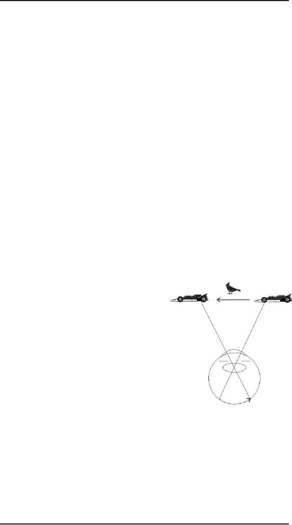
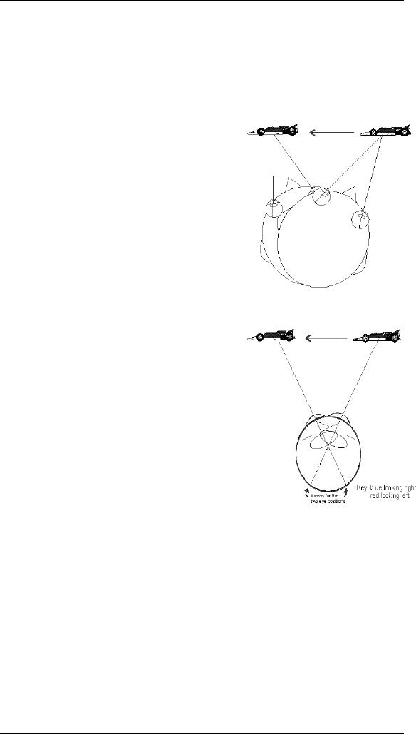
Assume
that while you are
staring at the bird,
a
racing
car zooms by. The
image of the car will
travel
across your retina as
indicated by the
dotted
line with the arrow.
This image
movement
will cause you to say that
the car
moves
from your right to your
left.
Now
suppose you were looking at
the car and
followed
its movement as it passes in
front of
you.
This
time you are following
the car by moving
your
eyes from right to
left.
Just as
before, your percept is that
of the car moving from right
to left.
This is
true even though the
image remains on the fovea
during the motion of the
car
and
your eyes.
Third
illustration shows that
another way to follow the
racing car is to keep the
eyes
steady
and to move just the head.
This causes the image to
project to exactly the
same
retinal
location at each instant (assuming
you move your head at
precisely the correct
angular
velocity) as the car moves
from right to left.
Once
again, the percept is of the
car moving from right to
left. This percept will be
the
same as
the two previous
illustrations. How the brain
distinguishes these
different
73
Human
Computer Interaction
(CS408)
VU
ways of
following moving objects is
the subject of much
research. One more
thing,
although
I have presented three distinct
ways of following moving
objects, these
illustrations
are gross simplifications. In point of
fact, when we follow moving
objects
we use
various combinations of head and
eye movements.
The
illustrations that, undoubtedly
you have been looking at demonstrate
that motion
perception
is very complex. Recall that
we perceive motion if we hold
our heads and
eyes
still as a moving object
passes in front of us. If we
decide to hold our heads
still
and
let our eyes follow
the object
we still
see it move. Finally, we
could even decide
to hold
our eyes steady and move
only our head to
follow an
object. The interesting
thing is all three
modes of
viewing a moving object
result in about
the
same perception.
So far we
have been concerned with
perceiving
real
movement. By real movement I mean
that the
physical
stimulus is actually moving
and we
perceive
it as moving. It is possible to
perceive
motion
when the stimulus is not
moving. An
example
is the motion after effect
(MAE)
demonstration
that was loaned to me by Dr.
Ben
Bauer,
Trent University.
Here is a
demonstration you can observe
for
yourself.
If you have the opportunity
to view a
waterfall,
(e.g.. Niagara Falls) look
at the falling
water
for about a minute and
then allow your
gaze
to fall
on any stationary object. A
building would
be
excellent. If you do this,
the texture of the
building,
perhaps even the windows will appear
to
move
up. Waterfalls usually are
not readily
available.
However, you can easily
build your
own MAE
apparatus. Take a round paper
plate.
Draw a
dozen or so heavy lines
radiating out from the
middle of the plate. Then
with a
pin
attach the plate through
its center to the eraser
end of a pencil. Now spin
the plate
at a
moderate speed. Don't spin
it so fast that the lines
become an indistinct blur.
After
viewing
the spinning plate for
about a minute stop it and
continue to look at
the
radiating
lines. What do you suppose
you will see? If you see
what most people
notice
the
radiating lines, which are
actually stationary, will appear to
rotate in the
direction
opposite
to that which you spun the
plate originally. If that is
way you saw
you
witnessed
the MAE. It is useful to try
this demonstration with the
paper plate because
it will
convince you that there are
no special tricks involved
with the MAE demo I
mentioned
above.
The
phenomenon of Motion After
Effects (MAE) has been studied
intensively by
visual
scientists for many years. One
explanation of how the MAE
works is the
following.
The visual system has
motion detectors that, like most neurons,
undergo
74

Human
Computer Interaction
(CS408)
VU
spontaneous
activity. You normally do
not see motion when
there is none because
the
spontaneous activity is in balance.
However, when you viewed
the downward
motion of
the black bars you
adapted the motion detectors
for motion in the
downward
direction. When the real
motion stopped, the spontaneous
activity was no
longer in
balance, the upward spontaneous
activity being slightly
stronger and thus
the
black bars appear to drift
upward. The adaptation
effect lasts for a short
time,
the
motion detection system
quickly becomes balanced
again and the
apparent
movement
stops.
Another
example of motion being
seen, when there is no
physical motion, is the
phi
phenomenon.
To those unacquainted with
the field of vision research
this
phenomenon
is probably unknown. However,
all of you have seen
it. The simplest
demonstration
of the phi phenomenon is to
have two illuminated spots
of light about 6
to 8 inches
apart. When these lights
alternately go on and off
one usually sees a
single
spot of
light moving back and
forth.
This
principle is used in many
movie marquees where one
sees a pattern of
lights
moving
around the display. In fact,
there is no physical motion,
only a series of
lights
going on
and off. Then, of course
there are the movies.
Movies are a series of
single
frames presented in
rapid succession. No one
would doubt the perception
of
movement
seen in the cinema. Yet, if
you analyze the strips of
film that yield
these
images
all you would see is a
series of frames each with a
slightly different
image.
When
they are rapidly projected on to
the viewing screen motion is
seen.
A similar
technique is used with
cartoons. The illustrator
actually draws a series
of
pictures.
When they are rapidly
presented to the viewer motion of
the cartoon
characters
is seen.
There
are two other instances when
movement is perceived. Have
you ever sat in a
train or
bus station patiently
waiting to get moving? Then
all of a sudden, low
and
behold
there you go. Or are you?
You feel no vibration,
something feels wrong.
Then
you
notice that it is the
vehicle (train or bus) right
next to you that is moving
and it
just
felt as if you were moving.
This is called induced
motion.
Finally,
(and this is an experiment
you can try at home)
view a small very dim
light in
an
otherwise completely dark
room. Make sure that
the light is in a fixed
position and
not
moving. After sometime in
the dark, the small
light will appear to move
somewhat
randomly.
This is called autokinetic
movement.
Here is
another little experiment
you can try. Look
around your surroundings
freely
moving
your eyes. As you move
your eyes around are the
stationary objects
moving?
Probably
not. Now look at some
object and with your
finger rapidly press
against
your
eyeball by pushing on your
eyelid. (Don't push directly
against the white
(sclera)
area). As
you force your eye to
move you will probably
notice that whatever you
are
looking
at starts to jump around. So
you can see that it
makes a difference
whether
you
move your eyes normally or
cause them to move in an
unusual manner.
75

Human
Computer Interaction
(CS408)
VU
Electrophysiologists
are scientists who insert
tiny electrode into the
brain of
experimental
subjects. They have discovered
that there are cortical
neurons which are
specialized
for movement. In fact, these
neurons often are so specialized
that they will
respond
best when the motion is in a
specific direction. E. Bruce
Goldstein presents a
neural
model in his textbook, which
shows how the early
retinal neural processing
could
occur which results in a signal
being sent to the brain
which say that
movement
has
occurred in a specific
direction.
How to
use MAE
Fixate
the red square in the center
of the diagram as the black
bars move down.
When
the black bars stop moving
down, continue to fixate the
red square and
pay
attention
to the black bars. What if
anything do the black bars
appear to be doing? If
they do
not appear to do anything, try
running the demonstration
again by clicking on
the
refresh icon at the top of
your screen. If the black
bars appeared to be drifting
upwards
you witnessed the motion
after effect. If you have a
slow computer, a 486
machine
or older, this demo may
not work very well
and you won't experience
the
MAE.
76
Table of Contents:
- RIDDLES FOR THE INFORMATION AGE, ROLE OF HCI
- DEFINITION OF HCI, REASONS OF NON-BRIGHT ASPECTS, SOFTWARE APARTHEID
- AN INDUSTRY IN DENIAL, SUCCESS CRITERIA IN THE NEW ECONOMY
- GOALS & EVOLUTION OF HUMAN COMPUTER INTERACTION
- DISCIPLINE OF HUMAN COMPUTER INTERACTION
- COGNITIVE FRAMEWORKS: MODES OF COGNITION, HUMAN PROCESSOR MODEL, GOMS
- HUMAN INPUT-OUTPUT CHANNELS, VISUAL PERCEPTION
- COLOR THEORY, STEREOPSIS, READING, HEARING, TOUCH, MOVEMENT
- COGNITIVE PROCESS: ATTENTION, MEMORY, REVISED MEMORY MODEL
- COGNITIVE PROCESSES: LEARNING, READING, SPEAKING, LISTENING, PROBLEM SOLVING, PLANNING, REASONING, DECISION-MAKING
- THE PSYCHOLOGY OF ACTIONS: MENTAL MODEL, ERRORS
- DESIGN PRINCIPLES:
- THE COMPUTER: INPUT DEVICES, TEXT ENTRY DEVICES, POSITIONING, POINTING AND DRAWING
- INTERACTION: THE TERMS OF INTERACTION, DONALD NORMANS MODEL
- INTERACTION PARADIGMS: THE WIMP INTERFACES, INTERACTION PARADIGMS
- HCI PROCESS AND MODELS
- HCI PROCESS AND METHODOLOGIES: LIFECYCLE MODELS IN HCI
- GOAL-DIRECTED DESIGN METHODOLOGIES: A PROCESS OVERVIEW, TYPES OF USERS
- USER RESEARCH: TYPES OF QUALITATIVE RESEARCH, ETHNOGRAPHIC INTERVIEWS
- USER-CENTERED APPROACH, ETHNOGRAPHY FRAMEWORK
- USER RESEARCH IN DEPTH
- USER MODELING: PERSONAS, GOALS, CONSTRUCTING PERSONAS
- REQUIREMENTS: NARRATIVE AS A DESIGN TOOL, ENVISIONING SOLUTIONS WITH PERSONA-BASED DESIGN
- FRAMEWORK AND REFINEMENTS: DEFINING THE INTERACTION FRAMEWORK, PROTOTYPING
- DESIGN SYNTHESIS: INTERACTION DESIGN PRINCIPLES, PATTERNS, IMPERATIVES
- BEHAVIOR & FORM: SOFTWARE POSTURE, POSTURES FOR THE DESKTOP
- POSTURES FOR THE WEB, WEB PORTALS, POSTURES FOR OTHER PLATFORMS, FLOW AND TRANSPARENCY, ORCHESTRATION
- BEHAVIOR & FORM: ELIMINATING EXCISE, NAVIGATION AND INFLECTION
- EVALUATION PARADIGMS AND TECHNIQUES
- DECIDE: A FRAMEWORK TO GUIDE EVALUATION
- EVALUATION
- EVALUATION: SCENE FROM A MALL, WEB NAVIGATION
- EVALUATION: TRY THE TRUNK TEST
- EVALUATION PART VI
- THE RELATIONSHIP BETWEEN EVALUATION AND USABILITY
- BEHAVIOR & FORM: UNDERSTANDING UNDO, TYPES AND VARIANTS, INCREMENTAL AND PROCEDURAL ACTIONS
- UNIFIED DOCUMENT MANAGEMENT, CREATING A MILESTONE COPY OF THE DOCUMENT
- DESIGNING LOOK AND FEEL, PRINCIPLES OF VISUAL INTERFACE DESIGN
- PRINCIPLES OF VISUAL INFORMATION DESIGN, USE OF TEXT AND COLOR IN VISUAL INTERFACES
- OBSERVING USER: WHAT AND WHEN HOW TO OBSERVE, DATA COLLECTION
- ASKING USERS: INTERVIEWS, QUESTIONNAIRES, WALKTHROUGHS
- COMMUNICATING USERS: ELIMINATING ERRORS, POSITIVE FEEDBACK, NOTIFYING AND CONFIRMING
- INFORMATION RETRIEVAL: AUDIBLE FEEDBACK, OTHER COMMUNICATION WITH USERS, IMPROVING DATA RETRIEVAL
- EMERGING PARADIGMS, ACCESSIBILITY
- WEARABLE COMPUTING, TANGIBLE BITS, ATTENTIVE ENVIRONMENTS