 |
TECHNIQUE |
| << MATERIALS |
| VALUES >> |
offers
a good deal of obstruction to the pen,
however, so that a
really
good
line is impossible.
Thin
letter-paper is sometimes recommended for pen and
ink work,
chiefly on
account of its transparency,
which obviates the necessity
of re-
drawing
after a preliminary sketch
has been worked up in
pencil. Over
the
pencil study a sheet of the
letter-paper is placed on which the
final
drawing
may be made with much
deliberation. Bond paper,
however,
possesses
the similar advantage of transparency
besides affording a
better
texture for the
pen.
CHAPTER
III
TECHNIQUE
The
first requirement of a good pen technique
is a good Individual The
Line,
a line of feeling and quality. It is
usually a surprise to the
beginner Individual
to
be made aware that the
individual line is a thing of
consequence,--a Line
surprise
due, without doubt, to the
apparently careless methods of
some
successful
illustrators. It is to be borne in mind,
however, that some
illustrators
are successful in spite of their
technique rather than
because
of
it; and also that the
apparently free and easy
manner of some
admirable
technicians is in reality very
much studied, very
deliberate,
and
not at all to be confounded
with the unsophisticated
scribbling of the
beginner.
The student is apt to find it
just about as easy to draw
like Mr.
Pennell
as to write like Mr. Kipling.
The best way to acquire
such a
superb
freedom is to be very, very
careful and painstaking. To
appreciate
how
beautiful the individual
line may be one has but to
observe the rich,
decorative
stroke of Howard Pyle, Fig.
66, or that of Mucha, Fig.
65, the
tender
outline of Boutet de Monvel,
the telling, masterly sweep
of
Gibson,
or the short, crisp line of
Vierge or Rico. Compared with
any of
these
the line of the beginner
will be either feeble and tentative, or
harsh,
wiry,
and coarse.
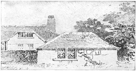
FIG.
6
B.
G. GOODHUE
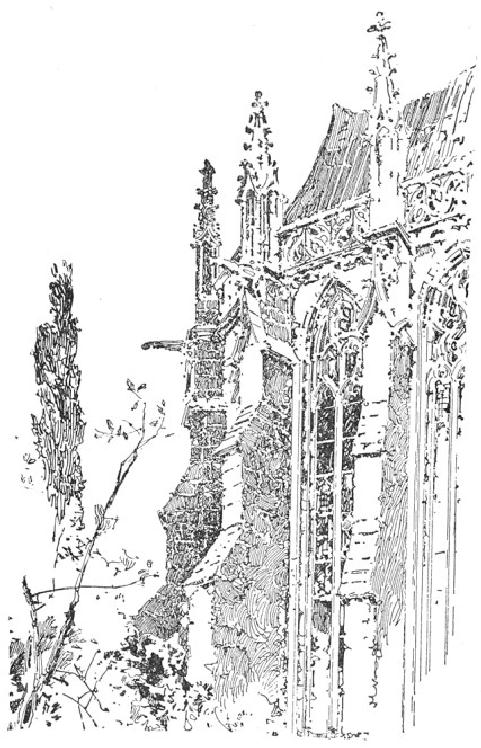
FIG.
7
HERBERT
RAILTON
The
second requisite is Variety of
Line,--not merely variety of size
Variety
of
and
direction, but, since each
line ought to exhibit a
feeling for the Line
particular
texture which it is contributing to
express, variety of character.
Mr.
Gibson's manner of placing
very delicate gray lines
against a series
of
heavy black strokes exemplifies
some of the possibilities of
such
variety.
Observe, in Fig. 6, what
significance is imparted to the
heavy
lines
on the roof of the little
foreground building by the
foil of delicate
gray
lines in the sky and
surrounding roofs. This
conjunction was
employed
early by Mr. Herbert Railton,
who has made a beautiful
use of
it
in his quaint architectural
subjects. Mr. Railton's technique
is
remarkable
also for the varied
direction of line and its
expression of
texture.
Note this characteristic in
his drawing of buttresses, Fig.
7.
FIG.
8
B.
G. GOODHUE
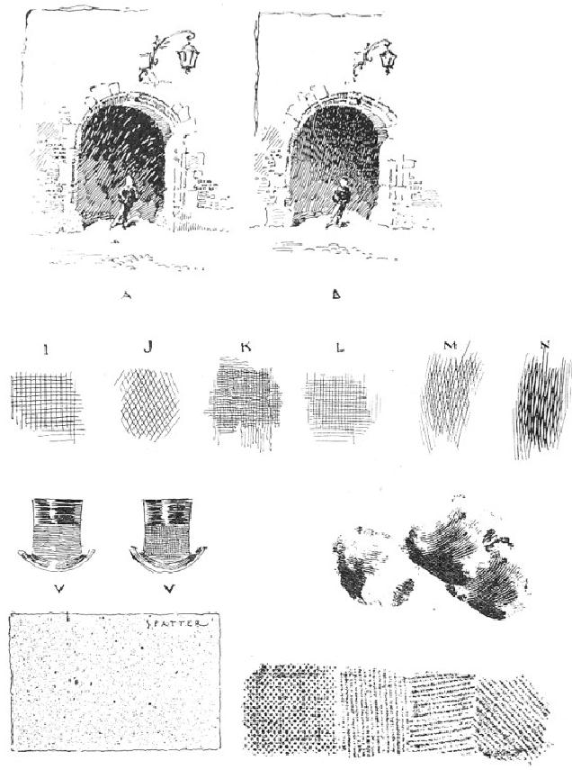
FIG.
9
C.
D. M.
FIG.
10
C.
D. M.
The
third element of good technique is
Economy and Directness of Economy
of
Method.
A tone should not be built
up of a lot of meaningless strokes. Method
Each
line ought, sensibly and
directly, to contribute to the
ultimate result.
The
old mechanical process of
constructing tones by cross-hatching
is
now
almost obsolete. It is still employed by
modern pen draughtsmen,
but
it is only one of many resources, and is
used with nice
discrimination.
At times a cross-hatch is very desirable
and very
effective,--as,
for example, in affording a subdued
background for
figures
having small, high lights. A
very pretty use of it is
seen in the
tower
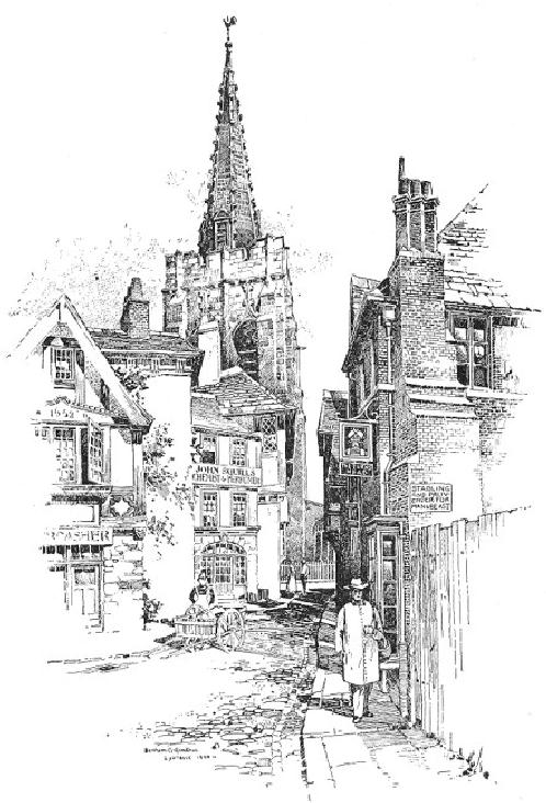
of Mr. Goodhue's drawing, Fig. 8.
Observe here how the
intimate
treatment
of the roofs is enhanced and relieved by
the foil of
closely-knit
hatch
on the tower-wall, and how
effective is the little area
of it at the
base
of the spire. The
cross-hatch also affords a satisfactory
method of
obtaining
deep, quiet shadows. See
the archway "B" in Fig. 9.
On the
whole,
however, the student is advised to
accustom himself to a
very
sparing
use of this expedient. Compare
the two effects in Fig. 9,
Some
examples
of good and bad cross-hatching are
illustrated in Fig. 10.
Those
marked
"I" and "J" may be set down
as bad, being too coarse.
The only
satisfactory
cross-hatch at a large scale
would seem to be that shown
in
"N,"
where lines cross at a sharp
angle; and this variety is
effectively
employed
by figure illustrators. Perhaps no
better argument against
the
necessity
for thus building up tones
could be adduced than the
little
drawing
by Martin Rico, shown in
Fig. 11. Notice what a
beautiful
texture
he gives to the shadow where
it falls on the street, how it
differs
from
that on the walls, how
deep and closely knit it
all is, and yet
that
there
is absolutely no cross-hatching. Remark,
also, how the textures
of
the
walls and roof and sky
are obtained. The student
would do well to
copy
such a drawing as this, or a
portion of it, at least, on a
larger scale,
as
much can be learned from
it.
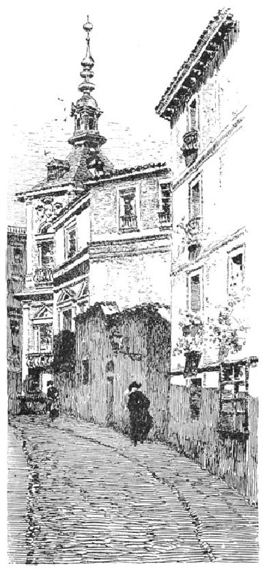
FIG.
11
MARTIN
RICO
I
have shown various methods
of making a tone in Fig. 12.
It will be Methods
of
observed
that Rico's shadow, in Fig.
11, is made up of a combination of
Tone-Making
"B"
and "C," except that he uses
"B" horizontally, and makes
the line
heavy
and dragging. The clear,
crisp shadows of Vierge are also
worthy
of
study for the simplicity of
method. This is beautifully
illustrated in the
detail,
Fig. 13. It would be
impossible to suggest atmosphere
more
vibrating
with sunlight; a result due to
the transparency of the
shadows,
the
lines of which are sharp and
clean, with never a
suggestion of cross-
hatch.
Notice how the lines of
the architectural shadows are
stopped
abruptly
at times, giving an emphasis
which adds to the brilliancy
of the
effect.
The drawing of the buildings
on the canal, by Martin
Rico, Fig.
14,
ought also to be carefully studied in
this connection. Observe
how
the
shadow-lines in this drawing, as in
that previously mentioned,
are
made
to suggest the direction of
the sunlight, which is high
in the
heavens.
An example of all that is
refined and excellent in pen
technique
is
the drawing by Mr. Alfred
Brennan, Fig. 15. The
student would do
well
to study this carefully for
its marvellous beauty of
line. There is
little
hatching, and yet the tones
are deep and rich. The
wall tone will be
found
to be made up similarly to "A" and "H" in
Fig. 12. The tone
"B" in
the
same Figure is made up of
lines which are thin at
the ends and big in
the
middle, fitting into each
other irregularly, and imparting a
texture
somewhat
different from that obtained
by the abrupt ending of
the
strokes
of "A." This method is also
employed by Brennan, and is a
very
effective
one. A good example of the
use of this character of
line
(unknitted,
however) is the drawing by Mr.
Leslie Willson, Fig. 16.
The
irregular
line "C" has good
possibilities for texture, and
the wavy
character
of "D" is most effective in
the rendering of shadows, giving
a
certain
vibration to the atmosphere. "E" and
"F" suggest a freer
method
of
rendering a tone; while "G"
shows a scribbling line that
is sometimes
employed
to advantage. The very interesting
texture of the coat, Fig.
17,
is
made with a horizontal line
having a similar return
stroke, as may be
noticed
where the rendering ends.
There are times when an
irresponsible
sort
of line is positively desirable,--say
for rough foreground
suggestion
or
for freeing the picture at
the edges.
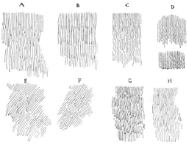
FIG.
12
C.
D. M.
FIG.
13
DANIEL
VIERGE
FIG.
14
FIG.
15
ALFRED
BREN
FIG.
16
LESLIE
WILLSON
I
have invariably found that
what presents the chief
difficulty to the Outline
student
of pen and ink is the management of the
Outline. When it is
realized
that, by mere outline, one may
express the texture of a coat or
a
tree
or a wall without any
rendering whatever, it will be seen
that nothing
in
pen drawing is really of so much
importance. Notice, for
example, the
wonderful
drawing of the dog in Fig.
34. Again, if a connected line
had
been
used to define the corners
of Railton's buttresses in Fig. 7
all the
texture,
would have been destroyed.
Instead of this he has used
a broken
outline,
sometimes omitting it altogether for a
considerable space. On the
ledges,
too, the lines are
broken. In Rico's drawing,
Fig. 11, all
the
outlines
may be observed to have a break here and
there. This broken
line
is particularly effective in out-door
subjects, as it helps to
suggest
sunlit
atmosphere as well as texture.
FIG.
17
DRAWING
FROM A PHOTOGRAPH
Architectural
outlines, however, are not
particularly subtle; it is
when
we
come to render anything with
vague boundaries, such as
foliage or
clouds
for example, that the
chief difficulties are
encountered. Foliage is
an
important element of landscape
drawing and deserves more
than
passing
consideration. To make a successful
rendering of a tree in pen
and
ink the tree must be first
well drawn in pencil. It is
absolutely
impossible
to obtain such a charming
effect of foliage as that
shown in
Mr.
Pennell's sketch, Fig. 18,
without the most painstaking
preparation in
pencil.
The success of this result
is not attributable merely to
the
difference
in textures, nor to the
direction or character of the
line; it is
first
of all a matter of good drawing.
The outline should be free
and
subtle
so as to suggest the edges of leafage,
and the holes near the
edges
should
be accented, otherwise they will be lost
and the tree will look
solid
and characterless. Observe, in the
same drawing, how Mr.
Pennell
suggests
the structure of the leafage by
the irregular outlines which
he
gives
to the different series of
lines, and which he emphasizes
by
bringing
the lines to an abrupt stop.
Observe also how the
stronger
texture
of the tree in Fig. 19 is obtained by
making the lines with
greater
abruptness.
Compare both of these Figures
with the foreground trees
by
the
same artist in Fig. 20.
The last is a brilliant
example of foliage
drawing
in pen and ink.
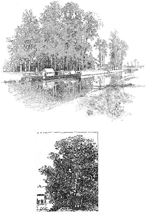
FIG.
18
JOSEPH
PENNELL
FIG.
19
JOSEPH
PENNELL
FIG.
20
JOSEPH
PENNELL
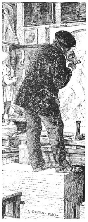
FIG.
21
E.
DANTAN
The
matter of Textures is very
important, and the student
should learn Textures
to
differentiate them as much as possible.
This is done, as I have
already
said,
by differences in the size and character of
the line, and in the
closeness
or openness of the rendering.
Observe the variety of
textures in
the
drawing of the sculptor by
Dantan, Fig. 21. The coat is
rendered by
such
a cross-hatch as "N" in Fig. 10,
made horizontally and with
heavy
lines.
In the trousers the lines do
not cross but fit in
together. This is an
excellent
example for study, as is also
the portrait by Raffa�lli,
Fig. 22.
The
textures in the latter
drawing are wonderfully well
conveved,--the
hard,
bony face, the stubby beard,
and the woolen cap with
its tassel in
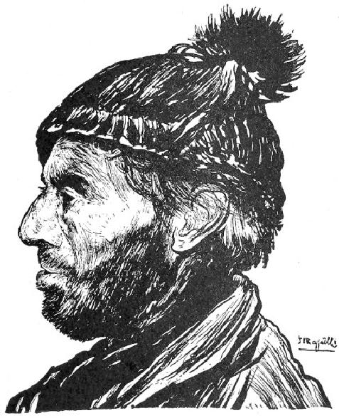
silhouette.
For the expression of
texture with the least
effort the drawings
of
Vierge are incomparable. The
architectural drawing by Mr. Gregg
in
Fig.
50 is well worth careful
study in this connection, as
are all of
Herbert
Railton's admirable drawings of
old English houses. (I
recommend
the study of Mr. Railton's
work with a good deal of
reservation,
however. While it is admirable in
respect of textures and
fascinating
in its color, the values
are likely to be most
unreal, and the
mannerisms
are so pronounced and so
tiresome that I regard it as
much
inferior
to that of Mr. Pennell, whose
architecture always appears,
at
least,
to have been honestly drawn
on the spot.)
FIG.
22
J.
F. RAFFAčLLI
The
hats in Fig. 10 are merely suggestions to
the student in the study
of
elementary
combinations of line in expressing
textures.
As
the mechanical processes of
Reproduction have much to do
with Drawing
for
determining
pen methods they
become important
factors for Reproduction
consideration.
While their waywardness and
inflexibility are the cause
of
no
little distress to the
illustrator, the limitations of
processes cannot be
said,
on the whole, to make for
inferior standards in drawing, as will
be
seen
by the following rules which
they impose, and for which a
strict
regard
will be found most
advisable.
First:
Make each line clear and
distinct. Do not patch up a
weak line or
leave
one which has been broken or
blurred by rubbing, for
however
harmless
or even interesting it may
seem in your original it will
almost
certainly
be neither in the reproduction.
When you make mistakes,
erase
the
offensive part completely,
or, if you are working on
Bristol-board
and
the area of unsatisfactoriness be
considerable, paste a fresh
piece of
paper
over it and redraw.
Second:
Keep your work open. Aim
for economy of line. If a
shadow
can
be rendered with twenty strokes do not
crowd in forty, as you
will
endanger
its transparency. Remember
that in reproduction the
lines tend
to
thicken and so to crowd out
the light between them.
This is so
distressingly
true of newspaper reproduction that in
drawings for this
purpose
the lines have to be
generally very thin, sharp, and
well apart.
The
above rule should be particularly
regarded in all cases where
the
drawing
is to be subject to much reduction.
The degree of reduction
of
which
pen drawings are susceptible is
not, as is commonly
supposed,
subject
to rule. It all depends on
the scale of the
technique.
Third:
Have the values few and
positive. It is necessary to keep
the
gray
tones pretty distinct to prevent
the relation of values being
injured,
for
while the gray tones darken
in proportion to the degree of
reduction,
the
blacks cannot, of course,
grow blacker. A gray tone
which may be
light
and delicate in the original,
will, especially if it be closely
knit,
darken
and thicken in the printing.
These rules are most
strictly to be
observed
when drawing for the
cheaper classes of publications.
For book
and
magazine work, however,
where the plates are touched
up by the
engraver,
and the values in a measure restored,
the third rule is not
so
arbitrary.
Nevertheless, the beginner
who has ambitions in this
direction
will
do well not to put
difficulties in his own way
by submitting work
not
directly
printable.
There
are a number of more or less
fanciful expedients employed in Some
modern
pen work which may be noted
here, and which are
illustrated in Fanciful
Fig.
10. The student is advised,
however, to resort to them as
little as Expedients
possible,
not only because he is
liable to make injudicious use of
them,
but
because it is wiser for him
to cultivate the less
meretricious
possibilities
of the instrument.
"Spatter
work" is a means of obtaining a
delicate printable
tone,
consisting
of innumerable little dots of ink
spattered on the paper.
The
process
is as follows: Carefully cover
with a sheet of paper all
the
drawing
except the portion which is
to be spattered, then take a
tooth-
brush,
moisten the ends of the
bristles consistently with
ink, hold the
brush,
back downwards, in the left
hand, and with a wooden
match or
tooth-pick
rub the bristles toward you
so
that the ink will spray
over the
paper.
Particular, care must be
taken that the brush is
not so loaded with
ink
that it will spatter in blots. It is
well, therefore, to try it
first on a