 |
MTH001
Elementary Mathematics
Lecture #
23:
·
Tabulation
·
Simple
bar chart
·
Component
bar chart
·
Multiple
bar chart
·
Pie
chart
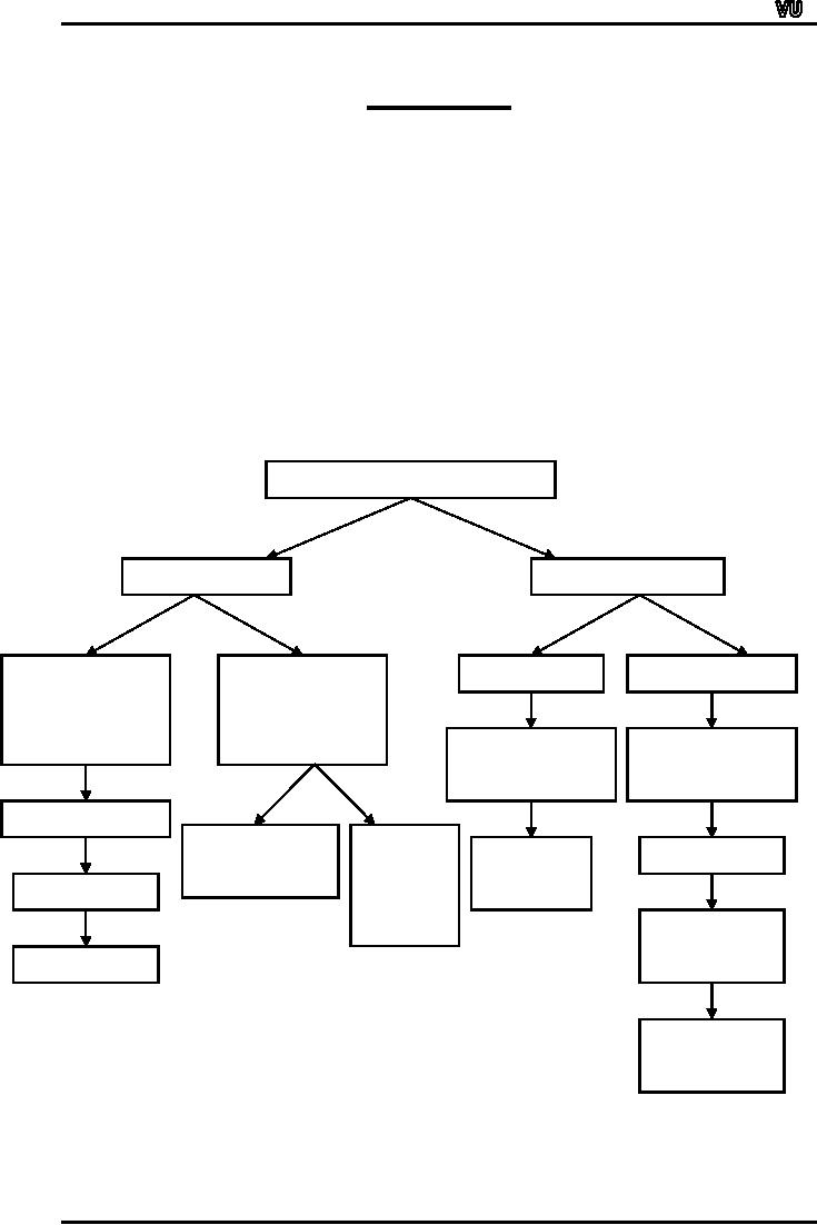
As
indicated in the last
lecture, there are two
broad categories of data ...
qualitative data
and
quantitative data. A variety of
methods exist for
summarizing and describing
these two
types
of data. The tree-diagram
below presents an outline of
the various
techniques
TYPES
OF DATA
Qualitative
Quantitative
Univariate
Bivariate
Frequency
Discrete
Continuous
Frequency
Table
Table
Frequency
Frequency
Distribution
Distribution
Percentages
Component
Multiple
Line
Chart
Histogram
Pie
Chart
Bar
Chart
Frequency
Polygon
Bar
Chart
Frequency
Curve
Page
149
MTH001
Elementary Mathematics
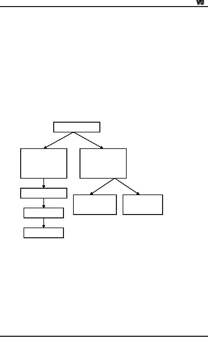
In
today's lecture, we will be
dealing with various
techniques for summarizing
and describing
qualitative
data.
Qualitative
Univariate
Bivariate
Frequency
Frequency
Table
Table
Percentages
Component
Multiple
Bar
Chart
Bar
Chart
Pie
Chart
Bar
Chart
We
will begin with the
univariate situation, and
will proceed to the
bivariate situation.
EXAMPLE:
Suppose
that we are carrying out a
survey of the students of
first year studying in
a
co-educational
college of Lahore. Suppose
that in all there are
1200 students of first year
in
this
large college.
We
wish to determine what
proportion of these students
have come from Urdu
medium
schools
and what proportion has
come from English medium
schools.
So
we will interview the
students and we will inquire
from each one of them
about their
schooling.
Page
150
MTH001
Elementary Mathematics
As
a result, we will obtain a
set of data as you can
now see on the
screen.
We
will have an array of
observations as follows:
U,
U, E, U, E, E, E, U, ......
(U
: URDU MEDIUM)
(E
: ENGLISH MEDIUM)
Now,
the question is what should
we do with this data?
Obviously,
the first thing that
comes to mind is to count
the number of students who
said
"Urdu
medium" as well as the
number of students who said
"English medium".
This
will result in the following
table:
Medium
of
No.
of Students
Institution
(f)
Urdu
719
English
481
1200
The
technical term for the
numbers given in the second
column of this table is
"frequency".
It
means "how frequently
something happens?"
Out
of the 1200 students, 719
stated that they had
come from Urdu medium
schools.
So
in this example, the
frequency of the first
category of responses is 719
whereas the
frequency
of the second category of
responses is 481.
It
is evident that this
information is not as useful as if we
compute the proportion
or
percentage
of students falling in each
category.
Dividing
the cell frequencies by the
total frequency and
multiplying by 100 we
obtain
the
following:
Medium
of
f
%
Institution
719
59.9
= 60%
Urdu
481
40.1
= 40%
English
1200
What
we have just accomplished is an
example of a univariate frequency
table pertaining to
qualitative
data.
Let
us now see how we can
represent this information in
the form of a
diagram.
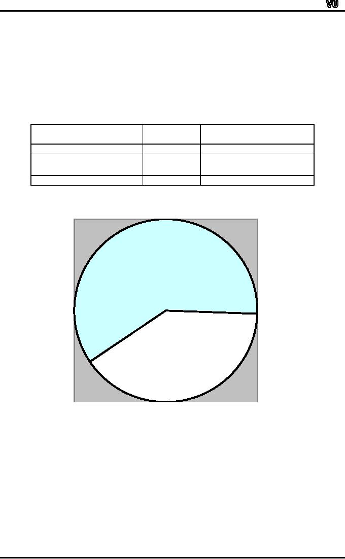
One
good way of representing the
above information is in the
form of a pie chart.
A
pie chart consists of a
circle which is divided into
two or more parts in
accordance with the
number
of distinct categories that we
have in our data.
For
the example that we have
just considered, the circle
is divided into two sectors,
the
larger
sector pertaining to students
coming from Urdu medium
schools and the
smaller
sector
pertaining to students coming
from English medium
schools.
How
do we decide where to cut
the circle?
Page
151
MTH001
Elementary Mathematics
The
answer is very simple! All
we have to do is to divide the
cell frequency by the
total
frequency
and multiply by 360.
This
process will give us the
exact value of the angle at
which we should cut the
circle.
PIE
CHART
Medium
of
f
Angle
Institution
215.70
719
Urdu
144.30
481
ENGLISH
1200
Urdu
215.70
English
144.30
Page
152
MTH001
Elementary Mathematics
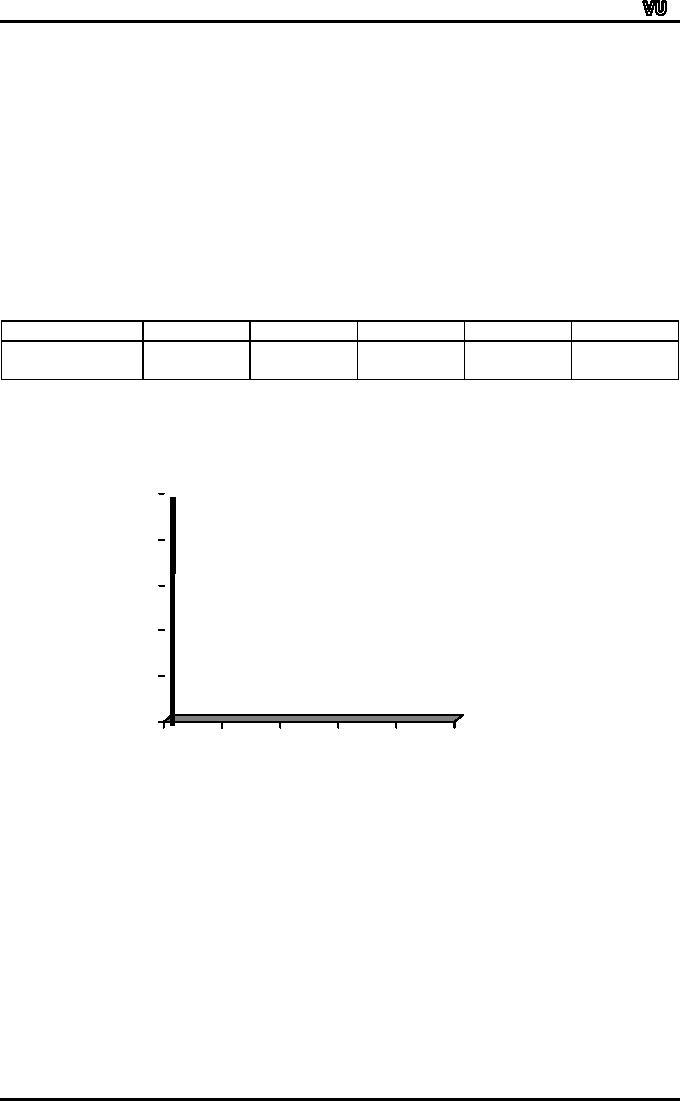
SIMPLE
BAR CHART:
The
next diagram to be considered is
the simple bar
chart.
A
simple bar chart consists of
horizontal or vertical bars of
equal width and
lengths
proportional
to values they
represent.
As
the basis of comparison is
one-dimensional, the widths of
these bars have no
mathematical
significance but are taken
in order to make the chart
look attractive.
Let
us consider an example.
Suppose
we have available to us information
regarding the turnover of a
company
for
5 years as given in the
table below:
Years
1965
1966
1967
1968
1969
Turnover
35,000
42,000
43,500
48,000
48,500
(Rupees)
In
order to represent the above
information in the form of a
bar chart, all we have to do
is to
take
the year along the
x-axis and construct a scale
for turnover along the
y-axis.
Next,
against each year, we will
draw vertical bars of equal
width and different
50,000
40,000
30,000
20,000
10,000
0
1965
1966
1967
1968
1969
heights
in accordance with
the
turn-over
figures that we have in our
table.
As
a result we obtain a simple
and attractive diagram as
shown below.
When
our values do not relate to
time, they should be
arranged in ascending or
descending
order
before-charting.
Page
153
MTH001
Elementary Mathematics
BIVARIATE
FREQUENCY TABLE:
What
we have just considered was
the univariate
situation.
In
each of the two examples, we
were dealing with one
single variable.
In
the example of the first
year students of a college,
our lone variable of
interest was
`medium
of schooling'.
50,000
40,000
30,000
20,000
10,000
0
1965
1966
1967
1968
1969
And
in the second example, our
one single variable of
interest was turnover.
Now
let us expand the discussion
a little, and consider the
bivariate situation.
Going
back to the example of the
first year students, suppose
that alongwith
the
enquiry
about the Medium of
Institution, you are also
recording the sex of
the
student.
Suppose
that our survey results in
the following
information:
Student
No.
Medium
Gender
1
U
F
2
U
M
3
E
M
4
U
F
5
E
M
6
E
F
7
U
M
8
E
M
:
:
:
:
:
:
Now
this is a bivariate situation; we
have two variables, medium
of schooling and sex of
the
student.
In
order to summarize the above
information, we will construct a
table containing a box
head
and
a stub as shown
below:
Sex
MALE
Female
Total
Med.
Urdu
English
Page
154
MTH001
Elementary Mathematics
Total
The
top row of this kind of a
table is known as the
boxhead and the first
column of
the
table is known as
stub.
Next,
we will count the number of
students falling in each of
the following four
categories:
1.
Male
student coming from an Urdu
medium school.
2.
Female
student coming from an Urdu
medium school.
3.
Male
student coming from an
English medium
school.
4.
Female
student coming from an
English medium
school.
As
a result, suppose we obtain
the following
figures:
Sex
MALE
Female
Total
Med.
202
517
719
Urdu
350
131
481
English
552
648
1200
Total
What
we have just accomplished is an
example of a bivariate frequency
table pertaining to
two
qualitative variables.
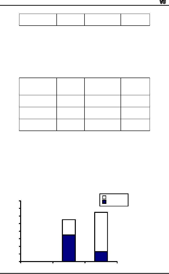
COMPONENT
BAR CHAR:
Let
us now consider how we will
depict the above information
diagrammatically.
This
can be accomplished by constructing
the component bar chart
(also known as the
subdivided
bar chart) as shown
below:
Urdu
English
800
700
600
500
400
300
200
100
0
Male
Female
Page
155

MTH001
Elementary Mathematics
In
the above figure, each
bar has been divided
into two parts. The
first bar represents
the
total
number of male students
whereas the second bar
represents the total number
of
female
students.
As
far as the medium of
schooling is concerned, the
lower part of each
bar
represents
the students coming from
English medium schools.
Whereas the upper part
of
each
bar represents the students
coming from the Urdu
medium schools.The advantage
of
this
kind of a diagram is that we
are able to ascertain the
situation of both the
variables at a
glance.
We
can compare the number of
male students in the college
with the number of
female
students, and at the same
time we can compare the
number of English
medium
students
among the males with
the number of English medium
students among the
females.
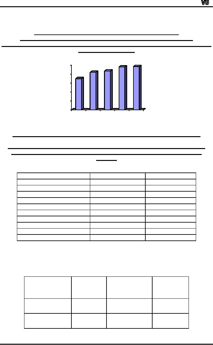
MULTIPLE
BAR CHART
The
next diagram to be considered is
the multiple bar
chart.
Let
us consider an example.
Suppose
we have information regarding
the imports and exports of
Pakistan for the
years
1970-71 to 1974-75 as shown in
the table below:
Imports
Exports
Years
(Crores
of Rs.)
(Crores
of Rs.)
1970-71
370
200
1971-72
350
337
1972-73
840
855
1973-74
1438
1016
1974-75
2092
1029
Source:
State Bank of
Pakistan
A
multiple bar chart is a very
useful and effective way of
presenting this kind of
information.
This
kind of a chart consists of a
set of grouped bars, the
lengths of which are
proportionate
to the values of our
variables, and each of which
is shaded or coloured
differently
in order to aid
identification.
With
reference to the above
example, we obtain the
multiple bar chart shown
below:
Multiple
Bar Chart Showing
Imports
& Exports
Page
156

MTH001
Elementary Mathematics
of
Pakistan 1970-71 to
1974-75
This
is a very good device for
the comparison of two
different kinds of
information.
2500
2000
1500
Imports
1000
Exports
500
0
If,
in addition to information regarding
imports and exports, we also
had information
regarding
production, we could
have
compared them from year to
year by grouping the three
bars together.
The
question is, what is the
basic difference between a
component bar chart and a
multiple
bar
chart?
The
component bar chart should
be used when we have
available to us information
regarding
totals and their
components.
For
example, the total number of
male students out of which
some are Urdu
medium
and
some are English medium.
The number of Urdu medium
male students and the
number
of
English medium male students
add up to give us the total
number of male
students.
On
the contrary, in the example
of exports and imports, the
imports and exports do not
add
up
to give us the totality of
some one thing!
Page
157
Table of Contents:
- Recommended Books:Set of Integers, SYMBOLIC REPRESENTATION
- Truth Tables for:DE MORGANS LAWS, TAUTOLOGY
- APPLYING LAWS OF LOGIC:TRANSLATING ENGLISH SENTENCES TO SYMBOLS
- BICONDITIONAL:LOGICAL EQUIVALENCE INVOLVING BICONDITIONAL
- BICONDITIONAL:ARGUMENT, VALID AND INVALID ARGUMENT
- BICONDITIONAL:TABULAR FORM, SUBSET, EQUAL SETS
- BICONDITIONAL:UNION, VENN DIAGRAM FOR UNION
- ORDERED PAIR:BINARY RELATION, BINARY RELATION
- REFLEXIVE RELATION:SYMMETRIC RELATION, TRANSITIVE RELATION
- REFLEXIVE RELATION:IRREFLEXIVE RELATION, ANTISYMMETRIC RELATION
- RELATIONS AND FUNCTIONS:FUNCTIONS AND NONFUNCTIONS
- INJECTIVE FUNCTION or ONE-TO-ONE FUNCTION:FUNCTION NOT ONTO
- SEQUENCE:ARITHMETIC SEQUENCE, GEOMETRIC SEQUENCE:
- SERIES:SUMMATION NOTATION, COMPUTING SUMMATIONS:
- Applications of Basic Mathematics Part 1:BASIC ARITHMETIC OPERATIONS
- Applications of Basic Mathematics Part 4:PERCENTAGE CHANGE
- Applications of Basic Mathematics Part 5:DECREASE IN RATE
- Applications of Basic Mathematics:NOTATIONS, ACCUMULATED VALUE
- Matrix and its dimension Types of matrix:TYPICAL APPLICATIONS
- MATRICES:Matrix Representation, ADDITION AND SUBTRACTION OF MATRICES
- RATIO AND PROPORTION MERCHANDISING:Punch recipe, PROPORTION
- WHAT IS STATISTICS?:CHARACTERISTICS OF THE SCIENCE OF STATISTICS
- WHAT IS STATISTICS?:COMPONENT BAR CHAR, MULTIPLE BAR CHART
- WHAT IS STATISTICS?:DESIRABLE PROPERTIES OF THE MODE, THE ARITHMETIC MEAN
- Median in Case of a Frequency Distribution of a Continuous Variable
- GEOMETRIC MEAN:HARMONIC MEAN, MID-QUARTILE RANGE
- GEOMETRIC MEAN:Number of Pupils, QUARTILE DEVIATION:
- GEOMETRIC MEAN:MEAN DEVIATION FOR GROUPED DATA
- COUNTING RULES:RULE OF PERMUTATION, RULE OF COMBINATION
- Definitions of Probability:MUTUALLY EXCLUSIVE EVENTS, Venn Diagram
- THE RELATIVE FREQUENCY DEFINITION OF PROBABILITY:ADDITION LAW
- THE RELATIVE FREQUENCY DEFINITION OF PROBABILITY:INDEPENDENT EVENTS