 |
DECORATIVE DRAWING |
| << ARCHITECTURAL DRAWING |
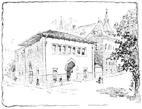
FIG.
60
C. D.
M.
Another
scheme for the treatment of
this same subject is
illustrated by
Fig.
60. Here, by the
introduction of the tree at the
right of the picture,
a
triangular
composition is adopted. Observe that
the sidewalk and roof
lines
at the left side of the
building radiate to the bottom and
top of the
tree
respectively. The shadow of
the tree helps to form the
bottom line of
the
triangle. In this case the
foreground figure is omitted, as it
would
have
made the triangularity too
obvious. In the color-scheme
the tree is
made
the principal dark, and this
dark is repeated in the
cornice shadow,
windows
and figures as before. The
gray tone of the old
building
qualifies
the blackness of the tree,
which would otherwise have
made too
strong
a contrast at the edge of
the picture, and so detracted from
the
interest
of the main building.
CHAPTER
VII
DECORATIVE
DRAWING
In
all modern decorative
illustration, and, indeed, in
all departments of
decorative
design, the influences of two
very different and distinct
points
of
view are noticeable; the one
demanding a realistic, the
other a purely
conventional
art. The logic of the
first is, that all good
pictorial art is
essentially
decorative; that of the second,
that the decorative subject
must
be
designed in organic relation to
the space which it is to
occupy, and be
so
treated that the design will primarily
fulfil a purely
ornamental
function.
That is to say, whatever of
dramatic or literary interest
the
decorative
design may possess must be,
as it were, woven into it,
so that
the
general effect shall please
as instantly, as directly, and as
independently
of the meaning, as the
pattern of an Oriental rug.
The
former,
it will be seen, is an imitative, the
latter an inventive art. In
the
one,
the elements of the subject
are rendered with all possible
naturalism;
while,
in the other, effects of atmosphere and
the accidental play of
light
and
shade are sacrificed to a
conventional rendering, by which
the design
is
kept flat upon the
paper or wall. One
represents the point of view
of
the
painter and the pictorial
illustrator; the other that
of the designer and
the
architect. The second, or conventional
idea, has now come to be
widely
accepted as a true basic
principle in decorative
art.
The
idea is not by any means
novel; it has always been
the fundamental The
New
principle
of Japanese art; but its
genesis was not in Japan.
The immediate Decorative
inspiration
of the new Decorative
school, as far as it is concerned
with School
the
decoration of books, at least, was found
in the art of Dürer,
Holbein,
and
the German engravers of the
sixteenth century,--interest in
which
period
has been lately so
stimulated by the Arts and
Crafts movement in
England.
This movement, which may
fairly be regarded as one of
the
most
powerful influences in latter-day
art, was begun with
the aim of
restoring
those healthy conditions which
obtained before the artist
and
the
craftsman came to be two
distinct and very much
extranged workers.
The
activities of the movement
were at first more directly
concerned
with
the art of good book-making,
which fructified in the
famous
Kelmscott
Press (an institution which,
while necessarily
undemocratic,
has
exerted a tremendous influence on
modern printing), and to-day
there
is
scarcely any sphere of
industrial art which has
not been influenced
by
the
Arts and Crafts
impetus.
This
modern decorative renaissance
has a root in sound art
principles, Criticisms
of
which
promises for it a vigorous vitality; and
perhaps the only serious
the
School
criticism
which has been directed
against it is, that it encourages
archaic
crudities
of technique which ignore
the high development of
the
reproductive
processes of the present day;
and, moreover, that
its
sympathies
tend towards mediæval life
and feeling. While such
a
criticism
might reasonably be suggested by
the work of some of
its
individual
adherents, it does not touch in
the least the essential
principles
of
the school. Art cannot be
said to scout modernity
because it refuses to
adjust
itself to the every caprice of Science.
The architect rather
despises
the
mechanically perfect brick
(very much to the surprise
of the
manufacturer);
and though the camera can
record more than the
pencil or
the
brush, yet the artist is
not trying to see more
than he ever did
before.
There
are, too, many decorative
illustrators who, while very
distinctly
confessing
their indebtedness to old examples;
are yet perfectly
eclectic
and
individual, both in the
choice and development of motive.
Take, for
example,
the very modern subject of
the cyclist by Mr. A. B. Frost,
Fig.
61.
There are no archaisms in it whatever.
The drawing is as
naturalistic
and
just as careful as if it were
designed for a picture. The
shadows, too,
are
cast, giving an effect of
strong outdoor light; but
the treatment, broad
and
beautifully simple so as to be
reconcilable with the
lettering which
accompanied
it, is well within
conventional lines. That the
character of
the
technical treatment is such as to place
no tax on the
mechanical
inventiveness
of the processman is not
inexcusable archæology.
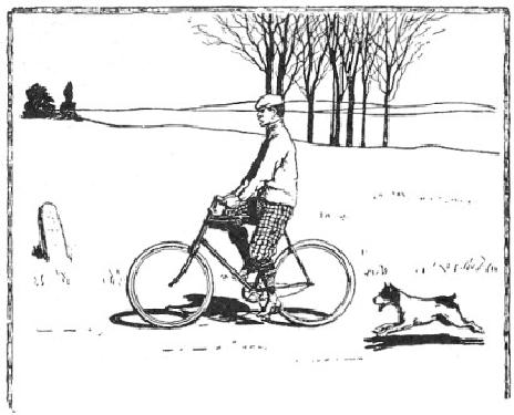
FIG.
61
A.
B. FROST
A
valuable attribute of this
conventional art is, that it
puts no bounds to
the
fancy of the designer. It is a
figurative language in which he
may get
away
from commonplace statement.
What has always seemed to me
a
very
logical employment of convention
appears in the Punch
cartoons
of
Sir
John Tenniel and Mr. Lindley
Sambourne. Even in those
cartoons
which
are devoid of physical
caricature (and they are
generally free from
this),
we see at a glance that it is
the political and not the
personal
relations
of the personæ that are
represented; whereas in the
naturalistic
cartoons
of Puck,
for example, one cannot resist
the feeling that
personalities
are being roughly
handled.
A
chief principle in all
decorative design and treatment is
that of Relation
Relation.
If the space to be ornamented be a
book-page the design and
treatment
must be such as to harmonize
with the printing. The
type must
be
considered as an element in the design,
and, as the effect of a page
of
type
is broad and uniformly flat,
the ornament must be made to
count as
broad
and flat likewise. The same
principle holds equally in
mural
decoration.
There the design ought to be
subordinate to the general
effect
of
the architecture. The wall
is not to be considered merely as
a
convenient
place on which to plaster a picture,
its structural purpose
must
be regarded, and this cannot be expressed
if the design or treatment
be
purely pictorial--if vague perspective
distances and strong
foreground
accents be used without
symmetry or order, except
that order
which
governs itself alone. In
other words, the decoration
must be
organic.
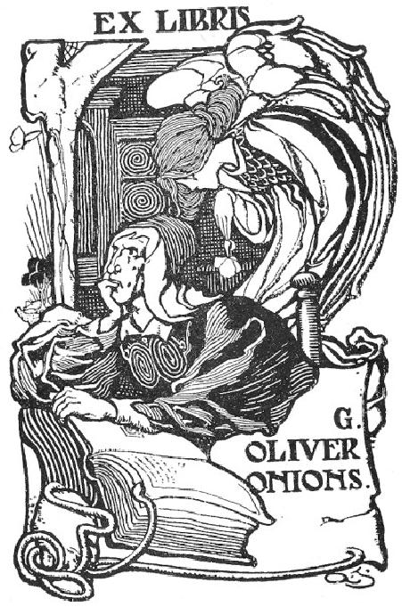
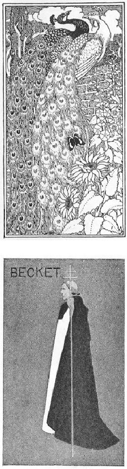
FIG.
62
ALFRED
G. JONES
Decorative
illustrations may be broadly
classified under three heads
as Classes
of
follows:
First, those wherein the
composition and the treatment
are both Decorative
conventional,
as, for example, in the
ex-libris by Mr. A. G. Jones, Fig.
Design
62.
Second, where the composition is
naturalistic, and the treatment
only
is
conventional, as in Mr. Frost's design.
Third, where the composition
is
decorative
but not conventional, and
the treatment is semi-natural, as
in
the
drawing by Mr. Walter Appleton
Clark, Fig. 63. (The
latter subject is
of
such a character as to lend itself
without convention to a
decorative
effect;
and, although the figure is
modeled as in a pictorial
illustration,
the
organic lines are so emphasized
throughout as to preserve the
decorative
character, and the whole
keeps its place on the page.)
Under
this
third head would be included
those subjects of a pictorial
nature
whose
composition and values are
such as to make them reconcilable
to
a
decorative use by means of borders or
very defined edges, as in
the
illustration
by Mr. A. Campbell Cross, Fig.
64.
FIG.
63
W.
APPLETON CLARK
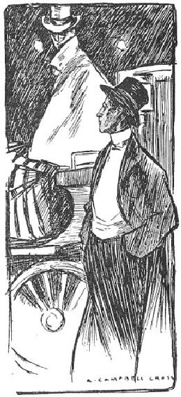
FIG.
64
A.
CAMPBELL CROSS
Another
essential characteristic of decorative
drawing is the The
emphasized
Outline. This may be heavy
or delicate, according to the
Decorative
nature
of the subject or individual
taste. The designs by Mr. W.
Outline
Nicholson
and Mr. Selwyn Image, for
instance, are drawn with a
fatness
of
outline not to be obtained
with anything but a brush;
while the
outlines
of M. Boutet de Monvel, marked as
they are, are evidently
the
work
of a more than usually fine
pen. In each case, however,
everything
is
in keeping with the scale of
the outline adopted, so that
this always
retains
its proper emphasis. The
decorative outline should
never be
broken,
but should be kept firm,
positive, and uniform. It may be
heavy,
and
yet be rich and feeling, as
may be seen in the Mucha
design, Fig.65.
Generally
speaking, the line ought not
to be made with a nervous
stroke,
but
rather with a slow, deliberate
drag. The natural wavering
of the hand
need
occasion no anxiety, and, indeed, it is
often more helpful to the
line
than
otherwise.
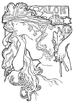
FIG.
65
MUCHA
Perhaps
there is no more difficult
thing to do well than to
model the
figure
while still preserving the
decorative outline. Several
examples of
the
skilful accomplishment of this
problem are illustrated
here. Observe,
for
instance, how in the quaint
Dürer-like design by Mr. Howard
Pyle,
Fig.
66, the edges of the
drapery-folds are emphasized in the
shadow by
keeping
them white, and see how
wonderfully effective the
result is. The
same
device is also to be noticed in the
book-plate design by Mr. A. G.
Jones,
Fig. 62, as well as in the
more conventional treatment of
the black
figure
in the Bradley poster, Fig.
67.
FIG.
66
HOWARD
PYLE
FIG.
67
WILL
H. BRADLEY
In
the rendering of decorative
subjects, the Color should
be, as much as Color
possible,
designed. Whereas a poster, which is made
with a view to its
entire
effect being grasped at once,
may be rendered in flat masses
of
color,
the head- or tail-piece for a
decorative book-page should be
worked
out in more detail, and the
design should be finer and
more
varied
in color. The more the
color is attained by means of
pattern,
instead
of by mere irresponsible lines, the
more decorative is the
result.
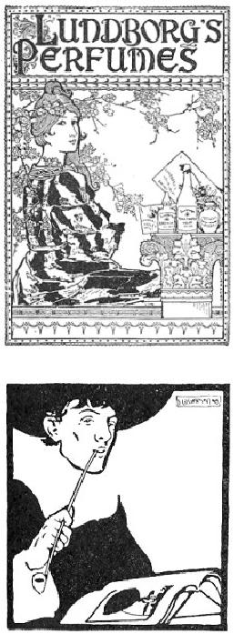
Observe
the color-making by pattern in
the book-plate by Mr. P. J.
Billinghurst,
Fig. 68. A great variety of
textures may be obtained
by
means
of varied patterns without affecting
the breadth of the
color-
scheme.
This may be noticed in the
design last mentioned, in which
the
textures
are extremely well rendered, as
well as in the poster design by
Mr.
Bradley for the Chap-Book,
just referred to.
FIG.
68
P.
J. BILLINGHURST
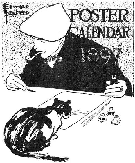
FIG.
69 "BEGGARSTAFF BROTHERS"
The
color-scheme ought to be simple
and broad. No set rules can
be
laid
down to govern its
disposition, which must
always have reference to
the
whole design. The importance
of employing such a broad and
simple
scheme
in decorative drawing needs no
better argument than
the
effective
poster design by the "Beggarstaff
Brothers," Fig. 69, and
that
by
Mr. Penfield, Fig.70. Of course the
more conventional the design
the
less
regard need be paid to anything like a
logical disposition of color.
A
figure
may be set against a black
landscape with white trees
without fear
of
criticism from reasonable people,
provided it looks effective
there.
FIG.
70
EDWARD
PENFIELD
A
word or two, in conclusion,
concerning some of the
modern Modern
decorative
draughtsmen. Of those who work in
the sixteenth century
Decorative
manner,
Mr. Howard Pyle is unquestionably
the superior technician. His
Draughtsmen
line,
masterly in its sureness, is
rich and charged with feeling. Mr.
H.
Ospovat,
one of the younger group of
English decorators, has also a
charming
technique, rather freer than
that of Mr. Pyle, and yet
reminding
one
of it. Mr. Louis Rhead is another of
the same school, whose
designs
are
deserving of study. The
example of his work shown in
Fig. 71--
excellent
both in color and in drawing--is one of
his earlier designs. Mr.
J.
W. Simpson, in the book-plate,
Fig. 72, shows the
broadest possible
decorative
method; a method which,
while too broad for anything
but a
poster
or a book-label, is just what
the student should aim at
being able
to
attain.
FIG.
71
LOUIS
J. RHEAD
FIG.
72
J.
W. SIMPSON
Some
of those decorators whose work shows a
Japanese influence
have
a
most exquisite method. Of these,
that remarkable draughtsman,
M.
Boutet
de Monvel, easily takes the
first place. Those who have
had the
good
fortune to see his original
drawings will not easily
forget the
delicate
beauty of outline nor the
wonderfully tender coloring
which
distinguishes
them. Mr. Maxfield Parrish is
another masterly
decorator
who
is noted for his free
use of Japanese precedent as well as
for the
resourcefulness
of his technique. The
drawings of Mr. Henry
McCarter,
too,
executed as they are in pure
line, are especially
valuable to the
student
of the pen. In respect both
of the design and treatment
of
decorative
subjects, the work of the
late Aubrey Beardsley is
more
individual
than that of any other
modern draughtsman. That of
our own
clever
and eccentric Bradley, while
very clearly confessing
its
obligations,
has yet a distinctive character of
its own. The work of
the
two
latter draughts men,
however, is not to be recommended to
the
unsophisticated
beginner for imitation, for
it is likely to be more
harmful
than
otherwise. Nevertheless, by steering
clear of the grotesque
conventions
with which they treat
the human figure, by
carefully
avoiding
the intense blacks in which
a great deal of their work
abounds,
and
by generally maintaining a healthy
condition of mind, much is to
be
learned
from a study of their
peculiar methods.
End
of the Project Gutenberg EBook of Pen
Drawing, by Charles Maginnis
***
END OF THIS PROJECT
GUTENBERG EBOOK PEN DRAWING
***
*****
This file should be named 17502-h.htm or 17502-h.zip
*****
This
and all associated files of various formats will be found
in:
http://www.gutenberg.org/1/7/5/0/17502/
Produced
by Robert J. Hall
Updated
editions will replace the previous one--the old editions
will
be renamed.
Creating
the works from public domain print editions means that
no
one
owns a United States copyright in these works, so the
Foundation
(and
you!) can copy and distribute it in the
United States without
permission
and without paying copyright royalties. Special
rules,
set
forth in the General Terms of Use part of
this license, apply to
copying
and distributing Project Gutenberg-tm electronic works
to
protect
the PROJECT GUTENBERG-tm concept and
trademark. Project
Gutenberg
is a registered trademark, and may not be
used if you
charge
for the eBooks, unless you receive specific
permission. If you
do
not charge anything for copies of this eBook,
complying with the
rules
is very easy. You may use this
eBook for nearly any
purpose
such
as creation of derivative works, reports, performances
and
research.
They may be modified and printed
and given away--you may
do
practically
ANYTHING with public domain eBooks.
Redistribution is
subject
to the trademark license, especially commercial
redistribution.
***
START: FULL LICENSE
***
THE
FULL PROJECT GUTENBERG
LICENSE
PLEASE
READ THIS BEFORE YOU
DISTRIBUTE OR USE THIS WORK
To
protect the Project Gutenberg-tm mission of promoting the
free
distribution
of electronic works, by using or distributing this work
(or
any other work associated in any way with
the phrase "Project