 |
Total
Quality Management
MGT510
VU
Lesson
# 38
CAUSE
AND EFFECT DIAGRAM AND OTHER TOOLS OF
QUALITY
Histograms
Variation
in a process always exists and
generally displays a pattern
that can be captured in a
histogram.
A
histogram is a graphical representation of the
variation in a set of data. It shows the
frequency or
number
of observations of a particular value or
within a specified
group.
Histograms
provide clues about the
characteristics of the population from
which a sample is
taken.
Using
a histogram, the shape of the
distribution can be seen
clearly, and inferences can be
made about
the
population. Patterns can be
seen that would be difficult
to see in an ordinary table of
numbers. The
check
sheet below was designed to
provide the visual appeal of a histogram
as the data are tallied. It
is
easy
to see how the output of the
process varies and what proportion of
output falls outside of
any
specification
limits.
Example
of a Check Sheet for Variable
Data
Frequency
20
19
18
17
16
15
14
X
13
X
12
X
X
11
X
X
X
10
X
X
X
9
X
X
X
X
8
X
X
X
X
7
X
X
X
X
6
X
X
X
X
X
5
X
X
X
X
X
4
X
X
X
X
X
X
X
3
X
X
X
X
X
X
X
2
X
X
X
X
X
X
X
1
X
X
X
X
X
X
X
X
X
X
123456
7
8
9
10
11
12
13
14 15 16 17 18 19 20
Time
to process loan request
(days)
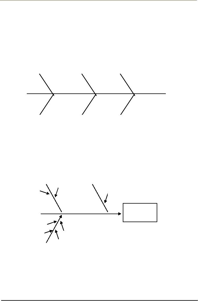
Cause-and-Effect
Diagrams
The
most useful tool for
identifying the causes of problems is a
cause-and-effect diagram, also known
as
a
fishbone or Ishikawa diagram,
named after the Japanese
quality expert who
popularized the concept.
A
cause-and-effect diagram is simply a
graphical representation of an outline
that presents a chain
of
causes
and effects. A team typically
uses a cause-and-effect diagram to
identify and isolate causes
of a
problem.
The technique was developed
by the late Dr. Kaoru
Ishikawa, a noted Japanese
quality expert.
159
Total
Quality Management
MGT510
VU
An
example is shown in figure below. At the
end of the horizontal line is the problem
to be addressed.
Each
branch pointing into the main
stem represents a possible cause.
Branches printing to the causes
are
contributors
to these causes. The diagram
is sued to identity the most
likely causes of a problem so
that
further
data collection and analysis can be
carried out.
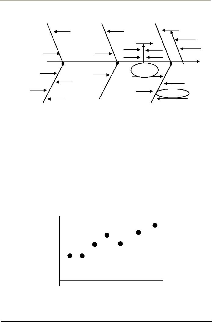
IDENTIFYING
CAUSES
Identifying
causes is a critical step in the
process. It involves the pairing
off of causes and effects.
Effects
are the problems that have
already been identified. Say
that one such problem has
been targeted
for
solving. A fishbone diagram
has six spines and
represents the six major
groupings of causes:
manpower
(personnel). Method,
Manpower
Method
Materials
Environment
Machines
Measurement
Sample
Cause-and-Effect Diagram
Materials,
machines (equipment), measurement, and
environment. All causes of work- place
problems
fall
into one of these major
groupings. Using the diagram,
team members' brainstorm causes
under each
grouping.
For example, under the machine
grouping, a cause might be
insufficient maintenance. Under
the
manpower grouping, a cause might be
insufficient training.
A
Cause-and-Effect Diagram
Client
Time
Overload
Unclear
directions
Overload
Word
processing
errors
Inattention
Did
not
No
spell check
understand
directions
Training
Typist
Cause-and-effect
diagrams are usually constructed in a
brainstorming setting so that
everyone can
contribute
their ideas. Usually small
groups drawn from operations or
management work with
an
experienced
facilitator. The facilitator guides the
discussion to focus attention on the
problem and its
causes,
on facts, not opinions. This
method requires significant interaction among
group members. The
facilitator
must listen carefully to the
participants and capture the important
ideas.
160
Total
Quality Management
MGT510
VU
Free-Throwing
Cause-And-Effect Diagram
Materials
People
Measurement
Regulation
backboard
Hit
Player
and
rim
Nothing
but net
Miss
Touch
rim
Short
Coach
Basketball
Coach
Right
Coach
Low
free-
throw
shooting
percentage
Shooting
Video
Practice
position
camera
Indoor
Technique
Ritual
Games
Focus
point
Outdoor
Environment
Equipment
Method
Scatter
Diagram
Scatter
diagrams illustrate relationships between
variables, such as the percentage of an
ingredient in an
alloy
and the hardness of the alloy, or the number of
employee errors and overtime worked
(Figure
3.12).
Typically the variables represent
possible causes and an effect
obtained from cause-and-effect
diagrams.A
general trend of the points going up
and to the right indicates that an
increase in one
variable
corresponds to an increase in the other.
If the trend is down and to the right, an
increase in one
variable
corresponds to a decrease in the other.
If no trend can be seen,
then it would appear that
the
variables
are not related. Of course,
any correspondence does not
necessarily imply that a change in
one
variable
causes a change in the other.
Both may be the result of something
else. However, if there is
reason
to believe causation, the scatter diagram
may provide clues on how to
improve the process.
Scatter
Diagram
Number
of
errors
Volume
of work
161
Total
Quality Management
MGT510
VU
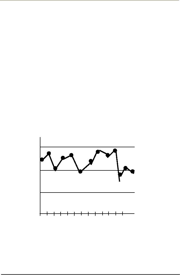
Control
Charts
These
tools are the backbone of statistical
process control (SPC), and were
first proposed by Walter
Shewhart
in 1924. Shewhart was the first to
distinguish between common causes and
special causes in
process
variation. He developed the control chart
to identify the effects of special causes.
Much of the
Deming
philosophy is based on the use of
control charts to understand
variation.
A
control chart displays the state of
control of a process. Time is
measured on the horizontal axis,
and
the
value of a variable on the vertical
axis. A central horizontal
line usually corresponds to the
average
value
of the quality characteristic being
measured. Two other
horizontal lines represent the
upper and
lower
control limits, chosen so
that there is a high probability
that sample values will fall
within these
limits
if the process is under control
that is, affected only by common
causes of variation. If points
fall
outside
of the control limits or if unusual
patterns such as shifts up or
down, trends up or down,
cycles,
and
so forth exist, special causes
may be present.
Two
fundamental mistakes that
can be made concerning
variation are
1.
Treating
special causes as common causes,
and
2.
Treating
common causes as special causes.
Control
charts minimize the risk of
making these two types of
mistakes. As a problem-solving tool,
they
allow
workers to identify quality problems as
they occur and base their
conclusions on hard facts.
EXAMPLE
OF A CONTROL CHART
Percent
shipped
within
24 hours
Upper
97%
Control
Limit
Average
93%
Lower
Control
89%
Limit
Day
1
2
2
4
5
6
7
8
9
10 11 12 13
162
Table of Contents:
- OVERVIEW OF QUALITY MANAGEMENT:PROFESSIONAL MANAGERIAL ERA (1950)
- TOTAL QUALITY MANAGEMENT AND TOTAL ORGANIZATION EXCELLENCE:Measurement
- INTEGRATING PEOPLE AND PERFORMANCE THROUGH QUALITY MANAGEMENT
- FUNDAMENTALS OF TOTAL QUALITY AND RATERS VIEW:The Concept of Quality
- TOTAL QUALITY MANAGEMENT AND GLOBAL COMPETITIVE ADVANTAGE:Customer Focus
- TOTAL QUALITY MANAGEMENT AND PLANNING FOR QUALITY AT OFFICE
- LEADERS IN QUALITY REVOLUTION AND DEFINING FOR QUALITY:User-Based
- TAGUCHI LOSS FUNCTION AND QUALITY MANAGEMENT
- WTO, SHIFTING FOCUS OF CORPORATE CULTURE AND ORGANIZATIONAL MODEL OF MANAGEMENT
- HISTORY OF QUALITY MANAGEMENT PARADIGMS
- DEFINING QUALITY, QUALITY MANAGEMENT AND LINKS WITH PROFITABILITY
- LEARNING ABOUT QUALITY AND APPROACHES FROM QUALITY PHILOSOPHIES
- TOTAL QUALITY MANAGEMENT THEORIES EDWARD DEMINGS SYSTEM OF PROFOUND KNOWLEDGE
- DEMINGS PHILOSOPHY AND 14 POINTS FOR MANAGEMENT:The cost of quality
- DEMING CYCLE AND QUALITY TRILOGY:Jurans Three Basic Steps to Progress
- JURAN AND CROSBY ON QUALITY AND QUALITY IS FREE:Quality Planning
- CROSBYS CONCEPT OF COST OF QUALITY:Cost of Quality Attitude
- COSTS OF QUALITY AND RETURN ON QUALITY:Total Quality Costs
- OVERVIEW OF TOTAL QUALITY APPROACHES:The Future of Quality Management
- BUSINESS EXCELLENCE MODELS:Excellence in all functions
- DESIGNING ORGANIZATIONS FOR QUALITY:Customer focus, Leadership
- DEVELOPING ISO QMS FOR CERTIFICATION:Process approach
- ISO 9001(2000) QMS MANAGEMENT RESPONSIBILITY:Issues to be Considered
- ISO 9001(2000) QMS (CLAUSE # 6) RESOURCES MANAGEMENT:Training and Awareness
- ISO 9001(2000) (CLAUSE # 7) PRODUCT REALIZATION AND CUSTOMER RELATED PROCESSES
- ISO 9001(2000) QMS (CLAUSE # 7) CONTROL OF PRODUCTION AND SERVICES
- ISO 9001(2000) QMS (CLAUSE # 8) MEASUREMENT, ANALYSIS, AND IMPROVEMENT
- QUALITY IN SOFTWARE SECTOR AND MATURITY LEVELS:Structure of CMM
- INSTALLING AN ISO -9001 QM SYSTEM:Implementation, Audit and Registration
- CREATING BUSINESS EXCELLENCE:Elements of a Total Quality Culture
- CREATING QUALITY AT STRATEGIC, TACTICAL AND OPERATIONAL LEVEL
- BIG Q AND SMALL q LEADERSHIP FOR QUALITY:The roles of a Quality Leader
- STRATEGIC PLANNING FOR QUALITY AND ADVANCED QUALITY MANAGEMENT TOOLS
- HOSHIN KANRI AND STRATEGIC POLICY DEPLOYMENT:Senior Management
- QUALITY FUNCTION DEPLOYMENT (QFD) AND OTHER TOOLS FOR IMPLEMENTATION
- BASIC SQC IMPROVEMENT TOOLS:TOTAL QUALITY TOOLS DEFINED
- HOW QUALITY IS IMPLEMENTED? A DIALOGUE WITH A QUALITY MANAGER!
- CAUSE AND EFFECT DIAGRAM AND OTHER TOOLS OF QUALITY:Control Charts
- STATISTICAL PROCESS CONTROL (SPC) FOR CONTINUAL QUALITY IMPROVEMENT
- STATISTICAL PROCESS CONTROL .CONTD:Control Charts
- BUILDING QUALITY THROUGH SPC:Types of Data, Defining Process Capability
- AN INTERVIEW SESSION WITH OFFICERS OF A CMMI LEVEL 5 QUALITY IT PAKISTANI COMPANY
- TEAMWORK CULTURE FOR TQM:Steering Committees, Natural Work Teams
- UNDERSTANDING EMPOWERMENT FOR TQ AND CUSTOMER-SUPPLIER RELATIONSHIP
- CSR, INNOVATION, KNOWLEDGE MANAGEMENT AND INTRODUCING LEARNING ORGANIZATION